UI Widgets
Overview
With Lens Studio’s UI Widget Custom Components you can create custom interactable interfaces to overlay on your Lenses.
Each UI widget comes with a number of settings, such as colors, visual states, and callbacks, which you can modify in the Inspector panel. The following guide walks you through how to add UI to your lenses.
All mentioned UI Widgets are leveraging Screen Transform component, and have to be a part of a valid screen transform hierarchy, which means are a child of an Orthographic Camera or a Canvas Component.
Install UI Widgets
Latest versions of UI Widgets are distributed as Custom Components and are available on the Lens Studio Asset Library.
Simply go to the asset library and look up UI Button, UI Color Picker, UI Toggle or UI Panel and click Install (or Update).
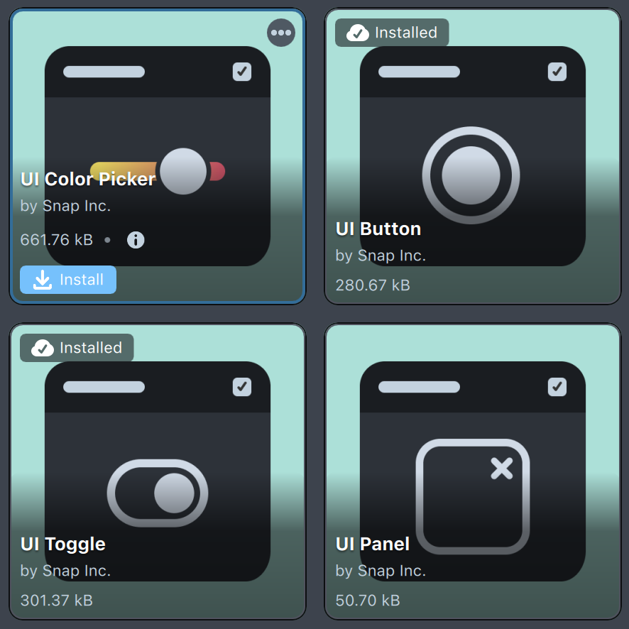
These Custom Components are distributed as editable. Right click to unpack and peek inside!
Add UI Widgets to Scene
Once you install Custom Components they become available in the Add Component menu in the Inspector panel of the Scene Object.
The easiest way to add them to scene is to follow next steps:
- Add a new
Screen TransformIn theScene Hierarchypanel. - With the newly created object selected press
Add Componentbutton in theInspectorpanel and select one of the UI Widgets.

You can improve the quality of your user interface by rendering them at device resolution. Take a look at the Pixel Accurate Rendering guide to learn more!
Repositioning and Resizing Widgets
Resizing or positioning the widget is as simple as editing its screen transform in the 2D Editor (Window->Editors->2D Editor) panel
Currently, Custom Component-based UI elements are not rendered in the 2D Editor. However, their rects can be seen and manipulated upon selection, as long as the transform on them is a Screen Transform.
Like any Screen Transform, you can also set your widget to be positioned relative to the screen across all devices. To do this, select your widget as above, and then give it a fixed size for both width and height, then select one of the Pin to Edge options to have that widget be relatively positioned to that edge.
Refer to the Screen Transform guide for more information.
Button UI widget is using 9-slicing material, so you can easily create buttons of different aspect ratio without any stretching.
Modifying Widgets
Some UI widgets (e.g., UI Button, UI Toggle) allow you to set up custom UI behavior through the Inspector panel. They have some shared properties as well as some specific ones.
Enable Interactable to allow the user to interact with the widget.
Set Render Order property to specify render order of this UI widget. Since Custom Component is not a Render Mesh Visual itself, we use this input to set render order of all visuals this widget contains.
Enable Use Colors to have the widget tint its color based on state.
Enable Use Textures to change the widget's texture based on its state. For UI Button, this sets Foreground Texture; for UI Toggle, Toggle texture.
Enable Edit Animations to modify how you want your widget to transition between each state. You can use prebuilt animations such as Bounce and Squish, as well as define your own using the Tween System using the Tween option, or modify its transform using the Transform option.
Adding Behaviors to Your Widgets
There are many ways to set up how your Lens will react to a user's action on a widget.
Enable Edit Event Callbacks to add callback behaviors via the Inspector panel. You can have your callbacks be:
- Behavior Script: Allows you to define a Behavior script component which will be triggered on the event.
- Behavior Custom Trigger: Allows you to call a Behavior Custom Trigger. To use this, create a Behavior whose trigger is
On Custom Trigger, and use the same trigger name on both the widget and the behavior.
- Custom Function: Allows you to set a script component and a list of function names. When an event is triggered, it will call the function name as an API. For example:
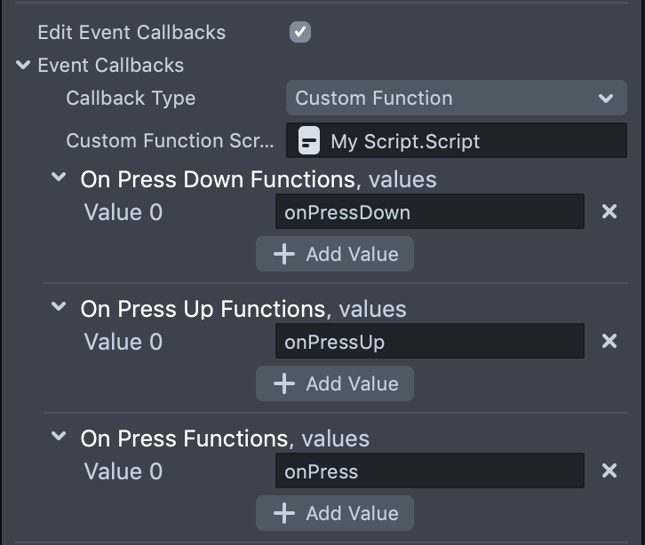
// Expose function via API to be used in UI system
script.onPressDown = function () {
  print('Button Pressed Down!');
};
script.onPressUp = function () {
  print('Button Pressed Up!');
};
Additionally, you can set up responses using a script.
//@input Component.ScriptComponent buttonWidget
// Print a message that indicates the button has been pressed down
function onPressDownCallback() {
  print('Button Pressed Down!');
}
script.buttonScript.onPressDown.add(onPressDownCallback);
Each widget has its own set of events related to its function. Take a look at the Available Widgets section below for more information on each widget's custom events.
Common Scripting Interface
All UI widgets besides Popup contain:
script.enableInteractable()- sets the UI widget’sInteractableproperty to False.script.disableInteractable()- sets the UI widget’sInteractableproperty to True.script.isInteractable()- returns the value of the UI widget’sInteractableproperty.script.removeCallback(eventType, callback)- removes a callback function from a valid event type on this UI widget.script.enableTouchEvents()- enables this UI widget to react to user input.script.disableTouchEvents()- disables this UI widget from reacting to user input.
UI Widget Custom Components
UI Button
UI Button Custom Component allows triggering events and behaviors when a button is pressed or released.
UI Button consists of several visual elements: Background Image, an optional Foreground image, and a Text component.
UI Button default background image uses 9-slicing material that allows it to adapt to any aspect ratio.
- Colors: The base color displayed on the Background Object’s Image Component in each of the “normal,” “pressed,” and “disabled” states, respectively.
- Textures: The textures displayed on the Background Object’s Image Component in each of the “normal,” “pressed,” and “disabled” states, respectively.
- Animations: Preset animation types that this UI Button uses:
- Bounce: Animate the UI Button’s scale with a shrink-down effect when pressed.
- Squish: Animate the UI Button’s scale with a squish effect when pressed.
- Tween: Animate using a Tween when pressed (see the Tweening guide here).
- Transform: Specify a position, rotation, or scale that this UI Button animates to for each of its states.
- Event Callbacks: Specify actions for this UI widget to perform when it transitions to each of its states:
- Callback Type: Specifies the type of actions that this UI widget triggers.
- Behavior Script: Triggers the assigned Behavior Scripts. Assign Behavior Script Components to this UI widget’s Event Callbacks in the
Inspector. See the Behavior guide for more info. - Behavior Custom Trigger: Sends a “Custom Trigger” via the Behavior system. Assign trigger names to this UI widget’s Event Callbacks in the
Inspector. - Custom Function: Invoke custom functions of a Script Component. Assign names of the functions to this UI widget’s Event Callbacks in the
Inspector. See the scripting guide here for more info.
- Behavior Script: Triggers the assigned Behavior Scripts. Assign Behavior Script Components to this UI widget’s Event Callbacks in the
- Callback Type: Specifies the type of actions that this UI widget triggers.
- Event Callbacks:
- onPressDown: Called on the first frame that this UI Button is pressed.
- onPressUp: Called on the first frame that this UI Button is released.
- onPress: Called on every frame that this UI Button is being pressed.
- Customize: Allows configuring prefabs for each component of the button.
- Background Prefab: Allows specifying background appearance. Requires Screen Transform and Image Component.
- Foreground Prefab: Allows specifying foreground appearance. Requires Screen Transform and Image Component.
- Text Prefab: Allows specifying text appearance. Requires Screen Transform and Text Component.
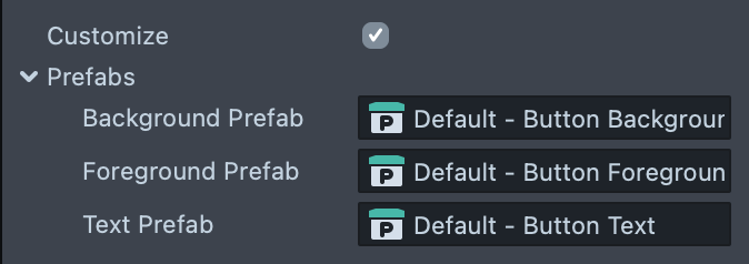
Check out the Customizing Prefabs section to find out how to override default looks!
Scripting Interface
script.isPressed()- Return true if this UI Button is in its “Pressed” state.script.pressDown()- Manually “Press Down” this UI Button, moving it to its “Pressed” state.script.pressUp()- Manually “Press Up” this UI Button, moving it to its “Normal” state.script.changeAnimationType(newType)- Change this button's animation type (Bounce,Squish,Tween,AnchorPosition,OffsetPosition,Rotation, orScale).script.changeStateValue(state, type, newValue)- Set the value of one of this UI Button’s transition types (Color,Texture,Tween,AnchorPosition,OffsetPosition,Rotation, orScale) for when it switches to a different state (normal,pressed, ordisabled).
//@input Component.ScriptComponent buttonScript
// Print a message that indicates the button has been pressed down
function onPressDownCallback() {
  print('Button Pressed Down!');
}
// Print a message that indicates the button has been pressed up
function onPressUpCallback() {
  print('Button Pressed Up!');
}
script.buttonScript.onPressDown.add(onPressDownCallback);
script.buttonScript.onPressUp.add(onPressUpCallback);
UI Color Picker / UI Slider
The UI Color Picker provides an interface to visualize and choose a color from a palette. You can choose to use the standard color range or between two colors of your choosing.
It can also be configured and used as a Slider, driving a value from 0 to 1.
- Color Recipient: Specify an optional Mesh Visual Component that will change color to match this Color Picker's color value.
- Parameter Name: Material parameter name to modify, should be vec4.
- Initial Position: A normalized initial position on the slider.
- Palette Type: Specify whether the palette should display the full color spectrum (Full Palette) or a range between 2 colors.
- Event Callbacks:
- onColorChanged: Called when the selected color has changed. Passes a vec4 parameter that specifies the newly selected color.
- onSliderValueChanged: Called when the selected color has changed. Passes a number parameter that specifies the current slider value, from 0-1.
- Customize:
- Cursor Prefab: A prefab used to display color picker cursor. Requires Screen Transform and Image Components.
- Palette Object: Prefab used for the visual appliance of the palette.
Unpack CC in separate projects to see built-in prefabs. You may always right-click on these input fields and reset to a default prefab.
Scripting Interface
script.getColor()- Get the current color (vec4) selected on this color picker.script.getSliderValue()- Get the current position value (0-1) of this color picker's slider.script.setSliderValue(value)- Manually set the value (0-1) of this color picker's slider, which will also change the selected color.
//@input Component.ScriptComponent colorPickerScript
//@input Component.MeshVisual targetVisual
// Set the target Mesh Visual's base color to the newly selected color
function changeColor(newColor) {
  script.targetVisual.mainPass.baseColor = newColor;
}
script.colorPickerScript.onColorChanged.add(changeColor);
// Change the selected color to the color at the bottom of the palette
script.colorPickerScript.setSliderValue(0);
UI Toggle
The UI Toggle triggers events and behaviors when it switches between on and off. It is the direct parent of a UI Button, using the UI Button’s “Press Down” and “Press Up” events to simulate on and off states, respectively.
- On By Default: If true, this UI Toggle will be initialized to its on state. If false, this UI Toggle will be initialized to its off state.
- Event Callbacks:
- onToggleOn: Called when this UI Toggle is switched to the On state.
- onToggleOff: Called when this UI Toggle is switched to the Off state.
- onToggle: Called when this UI Toggle switches states. Passes in a bool value specifying the new state.
- Customize:
- Background Prefab: The background Scene Object prefab used for color changing and touch boundaries.
- Button Prefab: The toggle Scene Object of the UI Button widget that this UI Toggle uses to display its on and off states.
- Toggle Touch Event: Specifies whether this UI Toggle switches states on Touch Start Event or Touch End Event.
Scripting Interface
script.getToggleValue()- Return true if this UI Toggle is on, false if it is off.script.toggleOff()- Manually switch this UI Toggle off.script.toggleOn()- Manually switch this UI Toggle on.script.toggle()- Manually switch this UI Toggle on if it is off, or off if it is on.
//@input Component.ScriptComponent toggleScript
//@input SceneObject sceneObject
// Switch between enabling and disabling a Scene Object based on
// whether the toggle is on or off
function switchObjectOnOff(toggleValue) {
  script.sceneObject.enabled = toggleValue;
}
script.toggleScript.onToggle.add(switchObjectOnOff);
UI Panel
The UI Panel allows control of all children widgets and block touch events.
In previous versions of the UI pack, it was necessary to place UI Widget Custom Components under a Panel. This is no longer required.
- Interactable: If false, this UI widget is disabled (i.e., it does not send events or react to user input, and moves the widget into its Disabled state).
- Advanced Options:
- Print Debug Statements: If true, this UI widget will print statements that are called by “printDebug” in its script to the Logger. This is useful for determining when your UI widget switches to a different state.
- Print Warning Statements: If true, this UI widget will print statements that are called by “printWarning” in its script to the Logger. This is useful for determining if your UI widget has not been properly initialized or is missing required properties.
- Disable Touch Events: If true, this UI widget will not react to the user’s touch input (it can still send events and trigger via scripting).
- Event Callbacks:
onEnableInteractable: Called on the first frame that this UI widget’sInteractableproperty is switched to True.onDisableInteractable: Called on the first frame that this UI widget’sInteractableproperty is switched to False.
Customizing Prefabs
Each UI Widget Custom Component uses default visual elements. Sometimes you need a more custom look. Let’s look into how this could be done:
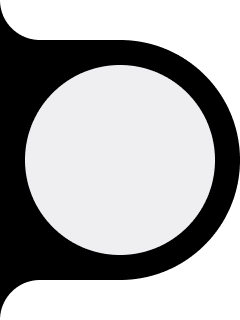
- Import new Texture you’d like to use, for example this one:
-
Create new Screen Image. Do not modify Screen Transform just yet.
-
Set Texture of the Image component with your texture of choice and configure other settings.
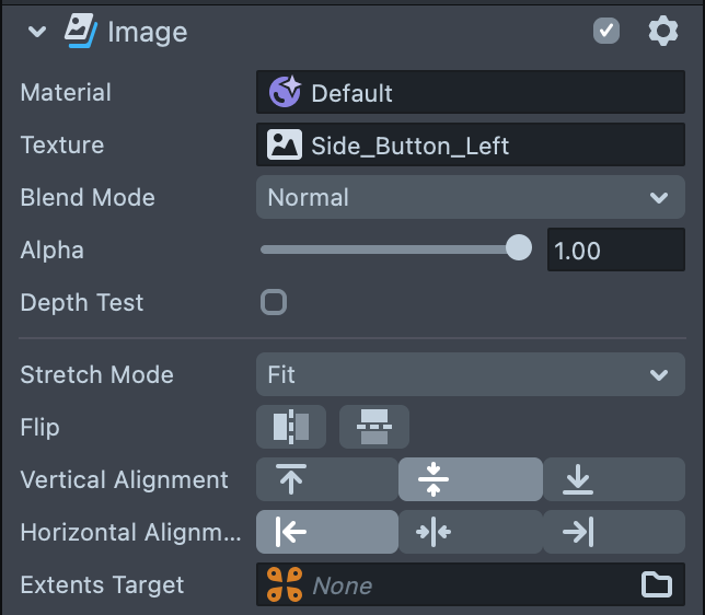
- Drag the Screen Image object from
Scene Hierarchypanel toAsset Browserpanel to create an object prefab.

- Select the SceneObject with a UI Button component and swap Background Prefab input.
And here is the result:
If you’d like to see and explore default prefabs you can right click on each UI Widget Custom Component and select “Unpack for Editing.” This will show everything bundled inside.
Check out the UI Button Textures Pack on Asset Library for these and more UI textures.