Friends Carousel
The Friends Carousel is a custom UI component designed to allow users to pick a friend by either scrolling through a list or tapping on a list element. This component enhances the user interface by providing a smooth and interactive way to select friends.
Installing the component
The Friends Carousel custom component is available in LS Asset Library. Press Install or Update and then add it to the Asset Browser panel by clicking the + button and looking up Friends Carousel.
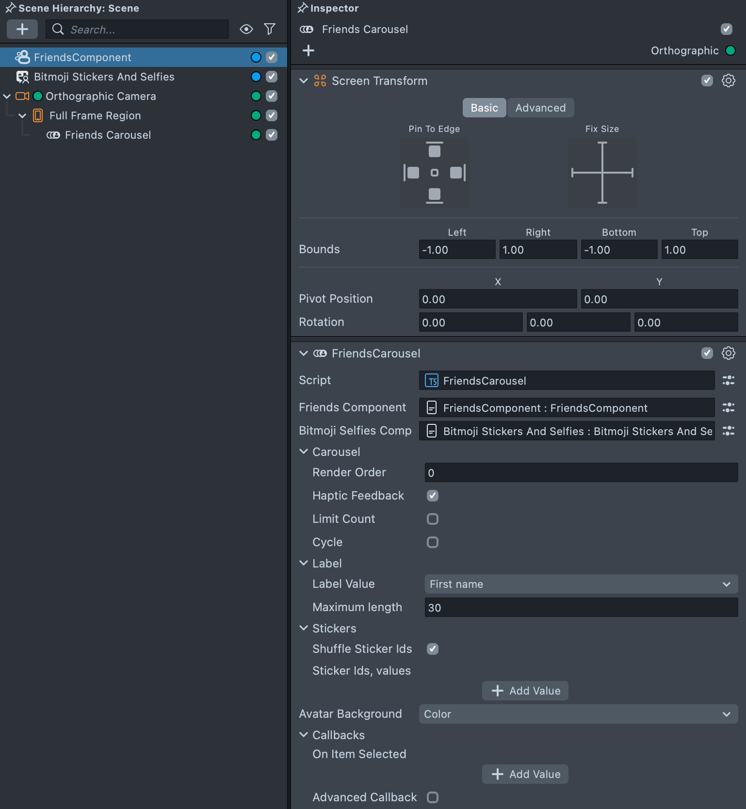
- Add the Friends Carousel custom component to the hierarchy within
Orthographic Camera. - Include a
Screen Transformto the object withFriends Carouselto place the carousel correctly on the screen. - Add
Friends ComponentandBitmoji Stickers And Selfiescustom components to a scene and place them above in hierarchy. - Put
Friends ComponentandBitmoji Stickers And Selfiesin inputs of theFriends Carouselcomponent. - Ensure the
Render Layermatches with theOrthographic Camera.
You can download the FriendsComponent and Bitmoji Stickers and Selfies components from the Asset Library.
API
interactable: boolean— Whether the carousel processes touch events from the user.read-only selectionAnchor: vec2— Position where the selected item rests, may differ from center by being offset along the carousel direction.getItems(): FriendItem[]— returns reference to the current items array.FriendItemis described here.getSelectedItem(): T | undefined— Returns selected item or undefined, if the carousel is empty. Same ascarousel.getItems(carousel.getSelectedIndex()).getSelectedIndex(): number— Returns index of the selected item or -1, if the carousel is empty.select(index: number): void— Instantly select item at the specified position. If the index is outside of range of the array, it will be wrapped.scrollTo(index: number, duration?: number): void— Animate selection of an item at the specified position. Index may be out of items array bounds, in such case it will scroll to the wrapped or limited index. For example, -1 will be the last item in cycled carousel, or the first one in non-cycled.enableInteractable(): void— Enable touch interaction with carousel. Same as settingcarousel.interactable = true.disableInteractable(): void— Disable touch interaction with carousel. Same as settingcarousel.interactable = false. Carousel may still be animated if there is animation momentum, or from script. To stop current animation ��– useselectmethod with currently selected index as parameter.reset(): void— Same ascarousel.select(0).
Events
All events receive this Friends Carousel instance as an argument.
onItemSelected: Event<FriendsCarousel>— Fired after the selected element changes, but before animation finished, if it was animated.onAnimationUpdate: Event<FriendsCarousel>— Fired after movement, either by touch, or selection animation from script.onAnimationFinished: Event<FriendsCarousel>— Fired after movement stopped.onInvalidated: Event<FriendsCarousel>— Fired when any values received from the carousel previously should be considered invalid.onUserInteractionStart: Event<FriendsCarousel>— Fired after user starts scrolling or taps the carousel and carousel is interactable.onUserInteractionEnd: Event<FriendsCarousel>— Fired after user releases touch, or carousel becomes non-interactable.onEnableInteractable: Event<FriendsCarousel>— Fired afterenableInteractable()is called, orinteractableproperty is set to true.onDisableInteractable: Event<FriendsCarousel>— Fired afterdisableInteractable()is called, orinteractableproperty is set to false.
Friend Item
Carousel Items are objects with the following properties:
image: Texture— Currently displayed image. It is either a fallback image, or user avatar, if user has Bitmoji and it's already loaded.primaryText: string— Label on the item, by default it's a Display Name, but can be changed in the Friends Carousel parameters.user: SnapchatUser— Actual SnapchatUser that this item represents.defaultAvatar: Texture— Fallback avatar for when the user has no Bitmoji, or it wasn't loaded yet.backgroundColor: vec4— Color of the background in the carousel item view.onInvalidated: Event<FriendItem>— Fired when the avatar is loaded. To optimize performance and prevent loading all avatars simultaneously, avatars are loaded as their corresponding carousel items are displayed. In cases where a carousel item is accessed (e.g., during theonItemSelectedevent) and the selected avatar has not yet loaded, it is recommended to subscribe to theonInvalidatedevent. This allows you to update the image once the event triggers. Remember to unsubscribe from the event when the selection changes again.
Setting callback from the script UI
On Item Selected— If the callback is a script method, it will receive the following arguments: selected index, items array, andFriends Carouselinstance. If the callback is aBehavior trigger, the selection will either call the specified trigger by name or append the selected index to the provided name. The trigger will be activated if theAppend Selected Indexoption is checked.
Other callbacks will pass then Friends Carousel instance to the script method arguments.
Sample setup using Behavior script
Let's try to print different text to the console when a friend is selected.
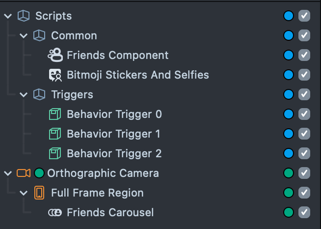
To achieve this, follow the instructions in the Installing the component paragraph and add some Behavior scripts.
This will give you a similar structure:
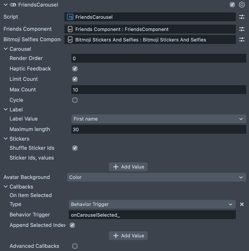
In Callbacks section - the one needed to add some interactivity - let's use the basic one On Item Selected.
Select Behavior trigger for Type, and be sure to check Append selected index.
You can use whatever name you want for trigger - in this example we will use onCarouselSelected_, but it could be coolCallback_ or hehehaha as well. We will re-use it in few moments in Behavior scripts.
The only thing left is to add this trigger to Behavior script.
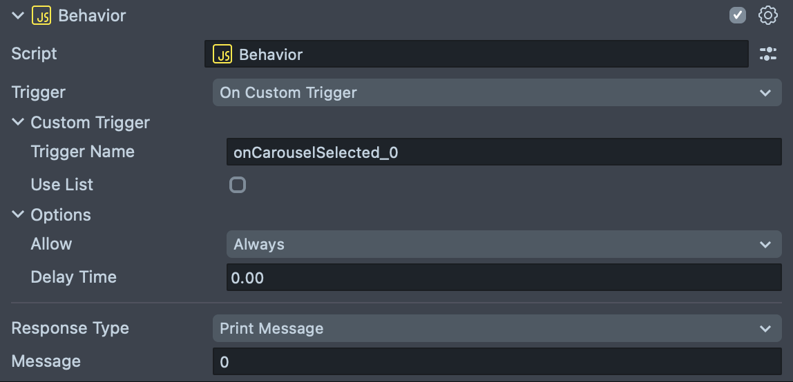
Select one of Behavior scripts, and select Custom Trigger for Trigger. Put your name here - onCarouselSelected_, and add index at the end, so it will be onCarouselSelected_0 for first friend selected in carousel.
Do the same one more time for next Behavior, and put onCarouselSelected_1 this time as Custom Trigger name.
Now, when you will select first or second friend in Carousel, the corresponding text will be printed in Lens Studio logger.
Voila! Do this for however many friends you want, and play around with the different Response Types the Behavior script has.
Please remember, that Friends Carousel is 0-based, so the first user has index 0, the second one is 1 and so on.
Adding interactivity through custom script
Let's print different text to the console when a friend is selected but using custom script this time. To achieve this, follow the instructions in the Installing the component paragraph and create SceneObject with JavaScript or TypeScript component then.
- JavaScript
- TypeScript
script.onCarouselSelected = (index, items, carousel) => {
  if (items.length == 0 || index == -1) {
    print('No friends :(');
  } else {
    print('Selected user: ' + items[index].user.displayName);
    // or
    print('Selected user: ' + carousel.getSelectedItem().user.displayName);
    // see `Friend Item` section for available properties
  }
};
@component
export class SampleScript extends BaseScriptComponent {
  onAwake() {}
  onCarouselSelected(index, items, carousel) {
    if (items.length == 0 || index == -1) {
      print('No friends :(');
    } else {
      print('Selected user: ' + items[index].user.displayName);
      // or
      print('Selected user: ' + carousel.getSelectedItem().user.displayName);
      // see `Friend Item` section for available properties
    }
  }
}
In the Friends Carousel component in Callbacks section let's use the basic one On Item Selected.
Select Script for Type, and put name of method in Name - from example above it should be onCarouselSelected.
That's all! Try playing around with the carousel and check the logger to see how different indices are printed there.