UI Composites
Spectacles Interaction Kit provides UI composites for creating sophisticated AR interfaces. For example, the Container composite component serves as a window for AR content (with various customization options), that allows users to view and manipulate assets in their physical space.
The ScrollView is a UI composite component that allows scroll interactions within a defined visual boundary using an Interactor. This boundary hides UI elements outside of it, offering a familiar 2D scrolling experience similar to interacting with a panel or screen. ScrollView is ideal for creating vertically or horizontally scrollable lists and menus, enhancing navigation in your AR application, and can also be used within a Container.
By using these ready-made components, you can focus on crafting unique user experiences instead of developing your own UI compositing components.
Relevant Components
ScrollView is a component for displaying scrollable content, such as lists of friends. It must be placed under a Canvas component in the hierarchy. All children of the ScrollView can be scrolled by dragging with an Interactor.
ScrollBar serves as a visual representation of how scrolled the content of a ScrollView is. The ScrollBar can also be dragged to move the ScrollView.
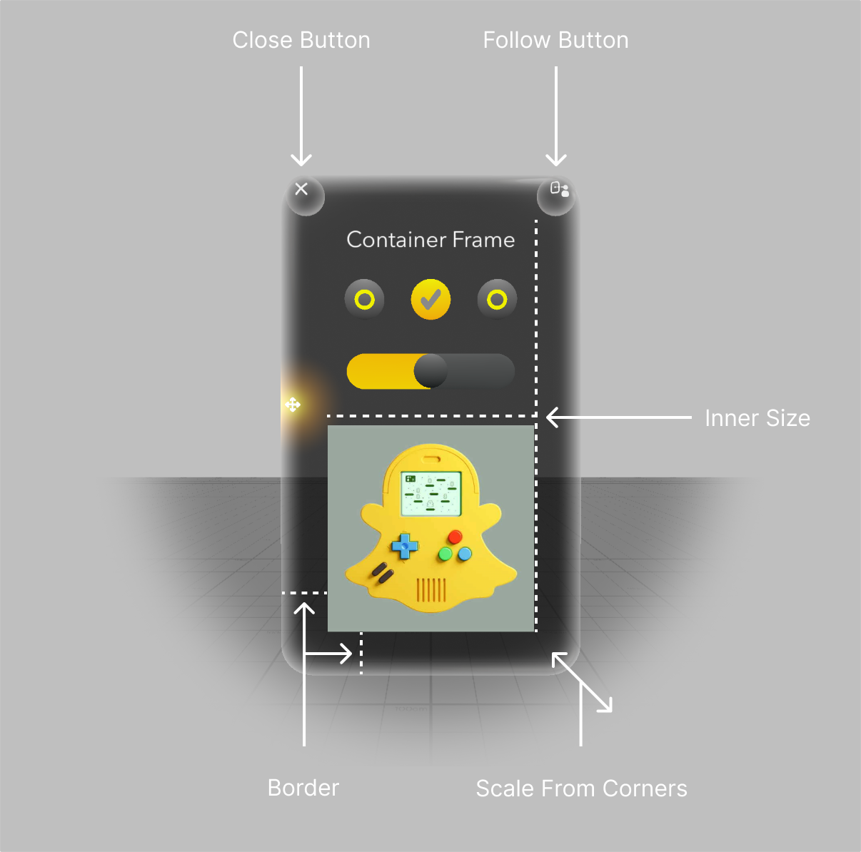
Container acts as a window for your content on Spectacles – an interactive UX solution for AR experiences.
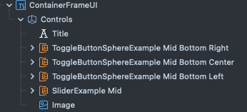
To use the Container in Lens Studio as a component, add the ContainerFrame component to an empty scene object. Then, add your content as a child to the container object as in the following hierarchy:
The component as it appears in Lens Studio, with settings configured for the above scene.
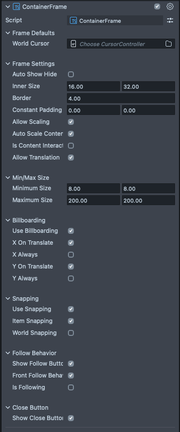
- Auto Show Hide
- Show and Hide Container on hover
- Inner Size: The size of the content area
- Border: The thickness of the border
Constant padding: An option to add a constant (un-scaled) padding on the x or the y. Useful for toolbars for example.
- Allow Scaling: Allows scaling of the Container from the corner
Auto Scale Content: Let the Container handle the rescaling of your content
Is Content Interactable: Disables Container interactions within the content area.
- Allow Translation: Allows translation manipulation of the Container
- Min/Max Size: Minimum and Maximum size for scaling the container
- Billboarding
- A behavior for the Container to face the camera
- Can turn on during translation or always on either the x or the y
- On translation or always
- Can turn on during translation or always on either the x or the y
- A behavior for the Container to face the camera
- Snapping
- Item to Item snapping
- Containers can snap to each other for positioning
- World Snapping
- Containers can also snap to the real world
- Item to Item snapping
- Follow Behavior
- Show follow button
- Front Follow Behavior attaches the default follow behavior to the button
- Is Following turns on the following behavior on creation
- Close Button
- Show Close Button
- Note: The close button has no attached default function. See example of attaching your close logic below:
Code Example
- TypeScript
- JavaScript
import { ContainerFrame } from "./SpectaclesInteractionKit/Components/UI/ContainerFrame/ContainerFrame"

@component
export class ExampleContainerScript extends BaseScriptComponent {
  container: ContainerFrame

  onAwake() {
    this.container = this.sceneObject.createComponent(
    ContainerFrame.getTypeName()
  )

  this.container.enableCloseButton(true)
  this.container.enableFollowButton(true)
  this.container.autoShowHide = false
  this.container.showVisual()

  this.container.closeButton.onTrigger.add(() => {
    // close function logic here
  })
}
const SIK = require('SpectaclesInteractionKit.lspkg/SIK').SIK;
const interactionConfiguration = SIK.InteractionConfiguration;

function onAwake() {
  // Wait for other components to initialize by deferring to OnStartEvent.
  script.createEvent('OnStartEvent').bind(() => {
    onStart();
  });
}

function onStart() {
  const container = this.sceneObject.createComponent(
    interactionConfiguration.requireType('ContainerFrame')
  );

  container.enableCloseButton(true);
  container.enableFollowButton(true);
  container.autoShowHide = false;
  container.showVisual();

  this.container.closeButton.onTrigger.add(() => {
    // close function logic here
  });
}

onAwake();