Dynamic Response
Dynamic Response enables the sharing of data and Snap media between the Snap Poster and Responder.
Dynamic Response Mechanic
The Dynamic Response mechanic works as follows:
- The Lens is equipped with the
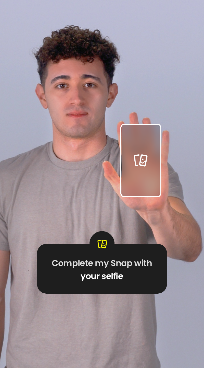
Dynamic Responsecustom component. Tappable areas can be added for the Snap and associated data to be transferred. - The Snapchat user opens the Lens, customizes it (e.g., modifies a widget), takes a Snap (image or video), and sends it to a friend or posts it to their Story.
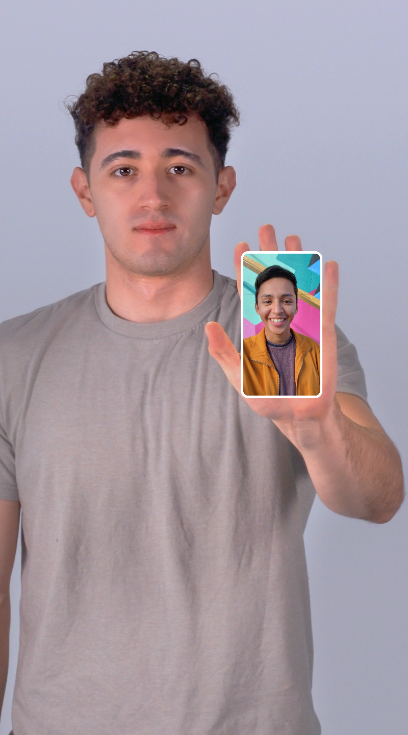
- Friends view the Snap, tap the tappable areas or the
Try it outbutton. - Tapping opens the Lens for the friend, where they can receive the Snap and any associated data shared by the Poster.
Dynamic Response Lenses feature two flows: Poster (when a Snapchat user posts a Story using the Lens or sends a Snap using the Lens to Friends) and Responder (when other Snapchat users interact with and respond to the Story or respond to a direct snap).
If tappable areas are added inside lens, Call-to-Actions (CTA) button will not show up on resulting snap/story, instead user will see tappable shimmer
Usage
To get started go to the Home page in Lens Studio and find the Image Response template in the Sample Project section. Click on the project card to download the template.
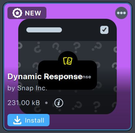
You can also download a Dynamic Response custom component from the Asset Library in the Featured folder by clicking the Install button.
Testing in Lens Studio
Lens Studio allows you to test transferring Snap and data between Poster and Responder.
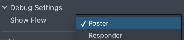
- Select
Posterflow in theDynamic ResponseComponent. - Double click on the Snap button in the preview.
- Preview is stopped.
- Select
Responderflow and refresh the preview.
Component Setup
Debug Settings
Debug settings are applied only in Lens Studio. They don't have any effect on the Lens within Snapchat.
Show Flow- what flow to display in Lens Studio.Tapped Area Key- if you select theResponderflow, you can simulate the key of the tappable area that triggers the Lens entry.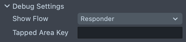
Widget Settings
If Dynamic Response custom component uses the widget it can only be used in 2D space. It should be placed under the Orthographic Camera and Canvas component with World Unit Type selected.
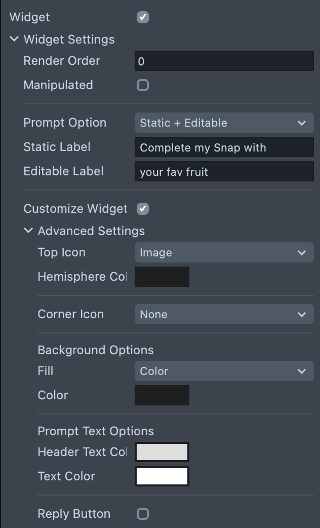
Manipulatedcheckbox: If enabled, the Snapchat user can move, scale and rotate the widget. If disabled, the widget is static.Prompt Option:Editable: The Snapchat user can tap on the prompt text and change it.Static: The text cannot be modified by tapping.Static + Editable: One line of the text (header) is static, and the others are editable.
StaticorEditableLabel: Text on the widget. If you want to break the line, add\nto the text input.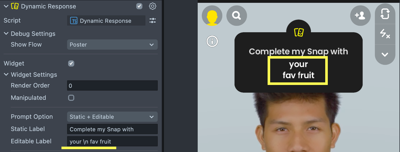
The following inputs can be hidden or unhidden by enabling the Customize Widget checkbox.
Top Icon: A non-interactable icon for visual purposes only.Hemisphere Color- color of the hemisphere where theTop Iconis located.
Corner Icon: A tappable icon with the following options:Edit Prompt: By tapping on this button, the Snapchat user can modify the prompt's text.Random Prompts: By tapping on this icon, a random text from thePromptslist is selected.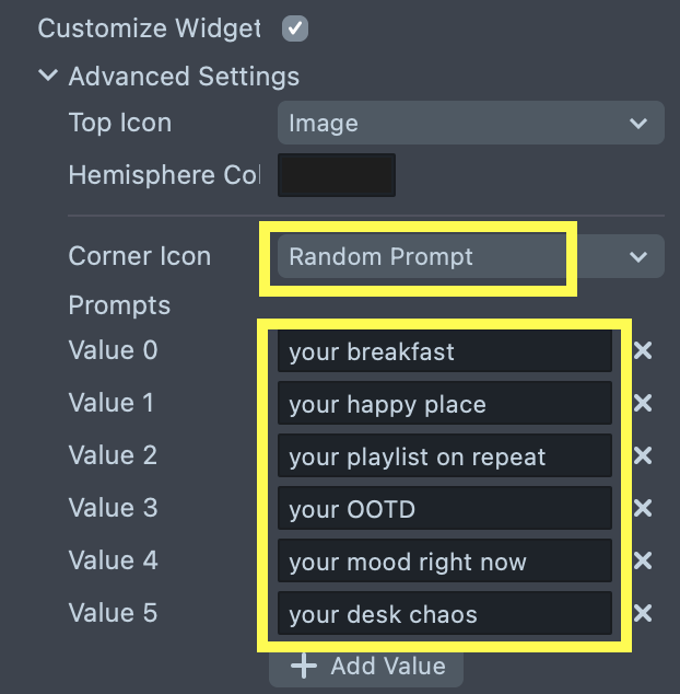
Background Options: You can set custom background's color or custom material.Prompt Text: You can customize the text color of the question and header. To make the text invisible, adjust the color's opacity to 0.Reply Button: If enabled, the widget will include a "Reply" button in the capture state (only for Poster).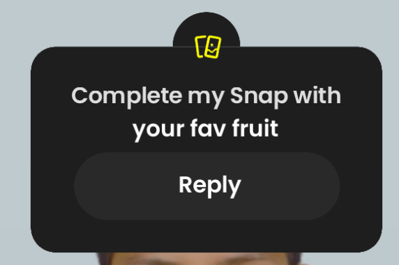
Reply Button Options: You can adjust the button's color or material and change the button's text color.
Poster Settings
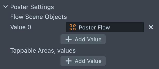
Flow Scene Objects- objects that will be enabled in Poster's state but disabled in Responder's.Tappable Areas- areas where the Responder can tap to enter the Lens. Each area contains a Screen Transform that identifying the region and also contain unique key. This key will allow you to identify the tappable area by with the Responder enters the Lens.
If Dynamic Response uses the widget, it automatically becomes a tappable area with "widget" key.
The tappable area is highlighted when Snapchat users open the Poster's Snap.
Tappable Areas have the following restrictions:
- The number of areas can not exceed 4. (Note that if you use a widget, it's already one tappable area).
- The total area (all tappable areas in summary) cannot be larger than 0.4 screen points.
- The tappable area key must be non-empty, unique and 24 characters or fewer.
- If tappable areas are added inside lens, Call-to-Actions (CTA) button will not show up on resulting snap/story, instead user will see tappable shimmer
Responder Settings
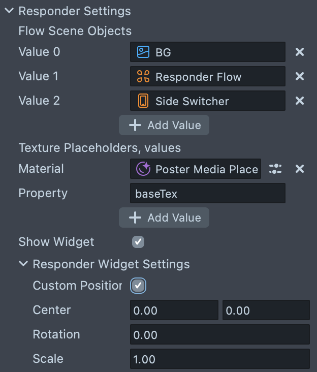
Flow Scene Objects- objects that will be enabled in Responder's state but disabled in Poster's.Texture Placeholders- placeholders for the Poster's Snap. Placeholder is a material and property name (baseTexby default).Show Widget- whether to show the widget for the Responder or not.Responder Widget Settings- custom center, rotation and scale of the widget that will be applied only for the Responder.
Component API
getLaunchState():Promise<"Poster" | "Responder">- returns the launch state. If tested in Lens Studio, return the state specified in theShow Flowinput field.
Usage Example:
const launchState = await this.dynamicResponse.getLaunchState();
switch (launchState) {
    case "Poster":
        // Poster flow
        break;
    case "Responder":
        // Responder flow
        break;
getAssociatedData():Promise<string>- associated data from the poster's state. Available only in the responder state.getPosterMedia():Promise<Texture>- poster's texture (supports video texture too). Available only in the responder state.getTappedAreaKey():Promise<string>- the key of the tapped area through which the user entered the Lens. Available only in the responder state. Note that this may be an empty string.addTappableArea(screenTransform: ScreenTransform, key: string):void- adds a tappable area. Available only in the poster state.removeTappableArea(key: string):void- removes tappable area with specified key. Available only in the poster state.addAssociatedData(data: unknown, key: string):void- stores data in the associated data. Associated data is an object where each data is stored by key. This object will be stringified and will be available later throughgetAssociatedData()in the responder state. Available only in the poster state.removeAssociatedData(key: string):void- removes data associated with the passed key. Available only in the poster state.
Associated Data Usage Example:
// Poster flow
this.dynamicResponse.addAssociatedData("myData", "dataKey");

...

// Responder flow
const dataJSON = await this.dynamicResponse.getAssociatedData();
try {
    const data = JSON.parse(dataJSON)["dataKey"] as string;
    // Use data
} catch(e) {
    print("Failed to retrieve data from the Dynamic Response.");
}
Component Helpers
There are two helper scripts for the Dynamic Response component: ScreenTransformDataTransfer and TextDataTransfer. You can find them in the Dynamic Response Helpers folder in Resources.
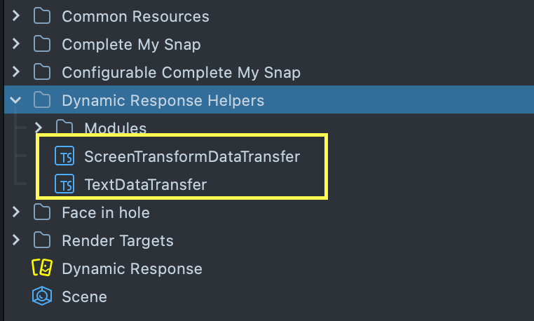
An example of using ScreenTransformDataTransfer can be found in the Configurable Complete My Snap setup.
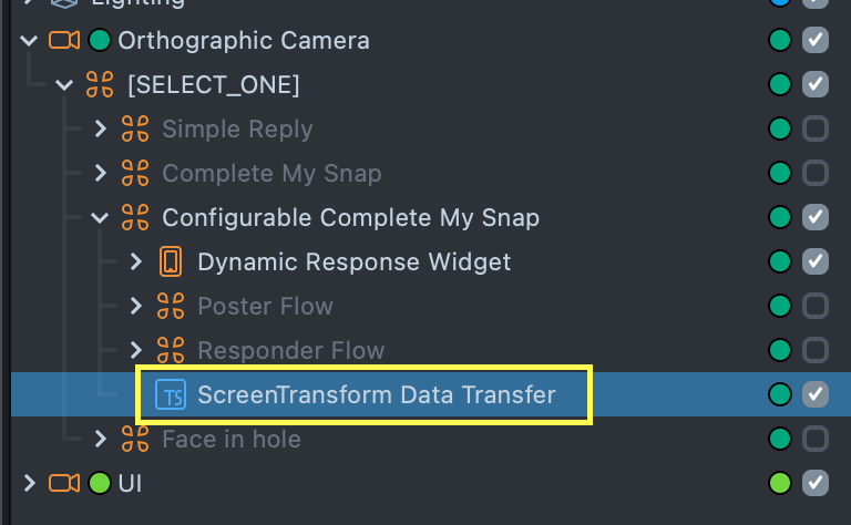
This setup allows the placeholder to be moved, scaled, and rotated, with the Lens transferring the updated placeholder transform data from the Poster to the Responder flow. The ScreenTransformDataTransfer script handles this data transfer.
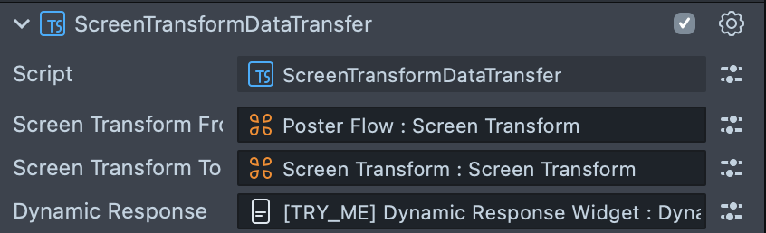
You can assign the Poster's Screen Transform to the ScreenTransformFrom input field and the Responder's Screen Transform to the ScreenTransformTo field. The script automatically gathers the Poster's screen transform data (position, scale, and rotation) and transfers it to the Responder flow.
The TextDataTransfer script works similarly but transfers the text value between two Text components.
Sample Project Examples
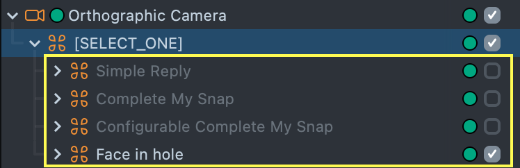
Image Response sample project contains 4 setups: Simple Reply, Complete My Snap, Configurable Complete My Snap and Face in hole. You can switch between them by selecting
one of the following objects:
You need to reset the preview each time you are switching between different setups.
Simple Reply
The Simple Reply setup demonstrates a flow where the Responder can reply with their picture on the specific prompt from the Poster.
Complete My Snap
The Complete My Snap setup demonstrates a flow where the screen is split into two parts: one filled with the Poster’s Snap and the other with the Responder’s Snap.
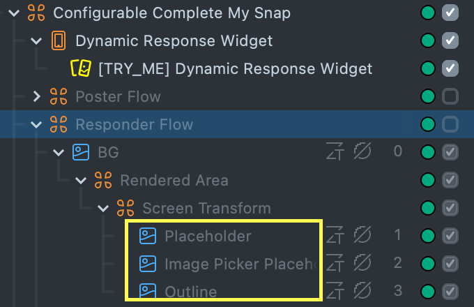
Configurable Complete My Snap
The Configurable Complete My Snap setup is similar to the regular Complete My Snap but offers more customization options for the Responder's Snap placeholder. You can modify these images to change the placeholder’s appearance:
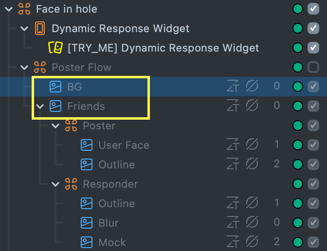
Face in hole
The Face in hole setup showcases a flow where the Poster’s and Responder’s faces are placed in placeholders on a customizable background. You can modify the BG and Friends images to change the background appearance.
Previewing Your Lens
To preview your Lens in Snapchat, follow the Pairing to Snapchat guide. A helpful testing flow to follow is:
- Push the Lens to your device in order to test Poster flow
- Take a Snap
- Send the Snap to yourself
- Open the Snap to test Responder flow
- Tip: It's often useful to save your Snap in chat, so that you can test it multiple times.
Note that you must send the Snap to yourself, since other users will not be able to interact with your Lens while you are using push to device flow.
Also note that the Dynamic Response functionality of a Snap is only available for a period of 30 days, even if the Snap itself is saved. Similarly, the Dynamic Response functionality will not be available if the Lens is hidden after publishing.