Shareable Text Edits
The Shareable Text Edits feature provides an easy way for in-Lens text to be edited, persisted, and shared by Snapchatters.
Shareable Text Edits Mechanics
Initial Snapchatter
- A Snapchatter opens a Shareable Text Edit Lens and sees an Edit button.
- The Snapchatter taps the Edit button, causing a keyboard to open, and customizes the Lens by entering text.
- The Snapchatter takes a Snap with the Lens and sends it to friends or posts it to their Story.
Second Snapchatter
- A second Snapchatter views the snap and unlocks the Lens.
- The Lens opens with the same text customization that the original Snapchatter entered.
- The second Snapchatter can press the edit button, which opens the keyboard with the original Snapchatter's text prefilled.
- Just like the original Snapchatter, the second Snapchatter can customize the Lens by entering text and can send out further Snaps.
Usage
Open the Shareable Text template in the Lens Studio home screen Sample Project section.
You can also install the Shareable Text Edits custom component in the Asset Library.

Click the Install button to install the custom component. Once installed, it can be added to a Scene Object.
Testing in Lens Studio
To test the Initial Snapchatter flow, select a ShareableTextEdit component and set Mock State to Initial User. Click the Edit button that appears in the Preview panel to activate the keyboard. Type whatever text you want to apply to the Lens.
To test the Second Snapchatter flow, select a ShareableTextEdit component and set Mock State to Second User. This will simulate the Lens being opened through a Snap that contained a Shareable Text Edit. Edit the text in Mock Shared Text field to simulate the text originally entered in the first Snap.
Testing on Device
To preview your Lens in Snapchat, follow the Pairing to Snapchat guide. A helpful testing flow to follow is:
- Push the Lens to your device, and open it
- Edit the shareable text by tapping the Edit button
- Take a Snap and send it to yourself
- Open the Snap to test second user flow
Note that you must send the Snap to yourself, since other users will not be able to interact with your Lens while you are using push to device flow.
Also note that text edits can't be shared through a Lens that is hidden after publishing, as hidden Lenses cannot be opened through Snaps.
If you would like to test the initial user experience, but you already have a text edit applied from testing the Lens previously, you can edit the text to be an empty string (blank). Then, swipe to another Lens and back to reapply the Lens with no customization.
Custom Component Options
Default Text

Set the Default Textfield to change the placeholder text that appears if no shared text data is available. Note that this value is purely visual and meant to act as a hint - it doesn't set the default starting text that appears in the keyboard.
Targets

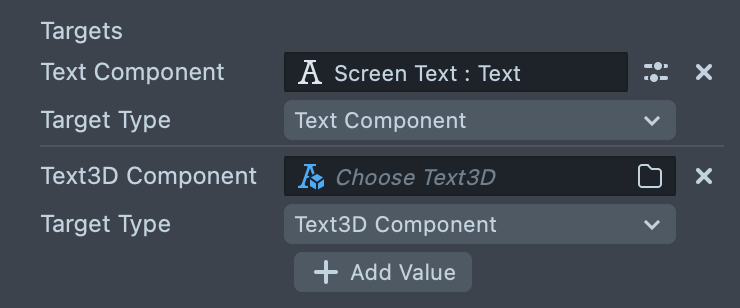
Add or set text targets in the Targets list to automatically apply text edits to Text or Text3D components. Every time edited text changes, each of these objects will have their text property updated to match.
Times that text is updated:
- The custom component becomes active, but the shared text edit state is not yet available. It usually becomes available within a few frames of the Lens launching.
- Empty string (
"") is applied
- Empty string (
- The Lens is opened for the first time, and no edit data is available
- The value in
Default Textis applied
- The value in
- The Snapchatter has opened the Edit keyboard, and makes a change to the text
- The current text in the keyboard is applied
- The Lens is opened from a Snap which was made with a text edit
- The text edit from the Snap is applied
- The Lens is not opened through a Snap, but text edits have previously been made
- The text edit is reapplied from the last time the Lens was used
Keyboard on Tap

If enabled, each object in the Targets list will be set up to open the Edit keyboard on tap. For more fine control over this, you can instead use the More Keyboard Triggers list under Advanced Options.
Using Multiple ShareableTextEdit Components
Multiple ShareableTextEdit components can coexist within the same scene, with some details to consider:
- All ShareableTextEdit components within a Lens use the same edited text. For example, if a user opens the Edit keyboard and types something in, all ShareableTextEdit components will apply that edited text to all of their Text Targets. There's no way to have multiple, different editable texts within the same Lens.
- The first ShareableTextEdit component to execute will set the
Default Textthat all other ShareableTextEdit components use. - Although it won't break anything, you may want to disable
Use Mock Edit UIon all but oneShareableTextEditcomponents, since each one will create its own Mock UI button in Lens Studio.
Sample Project Examples
Three examples are included in the template project. Enable each one to test them out.
Simple 3D Text
Applies text edits to 3D text which is animated with tweens. Tapping on the text will open the edit keyboard. Customize the Text3D component to change how it looks.
Editable Hat
Applies text edits to the text on a head-tracked hat. To customize the hat model, check out the Hat object's children, and the materials applied to them. To customize the text, check out the Screen Text object under the Hat Text Camera.
Simple Frame Text
Applies text edits to Screen Text within a simple frame. Check out the Frame object to customize the frame, and the Simple Screen Text object to customize the text.
ShareableTextEdit Custom Component API
If you would like to interact with the ShareableTextEdit custom component through script, Typescript definition files have been included in the template project to allow strong typing with Typescript, and type hinting in Javascript in most IDEs. You can also unpack the custom component which will provide full access to the source code and allow input support in Typescript (@input shareableTextEdit: ShareableTextEdit).
getCurrentText() : string
Returns the current text edit applied to the lens. Note that this can be null or empty when the lens first launches.
openKeyboard() Open the built-in Edit keyboard so that the user can customize text.
addTextTarget(text:Text|Text3D) Add a Text or Text3D component that will automatically get updated along with the text customization.
addKeyboardOpenerInteraction(interaction:InteractionComponent) Add an interaction component that triggers the edit keyboard to open on tap.
onTextChanged: CachedEvent<TextUpdateInfo> Event that triggers whenever the edited text changes, or initially becomes available. Note that upon subscribing, if text is already available the event will immediately trigger.
Example usage:
shareableTextEdit.onTextChanged.add((info) => {
  print('new text: ' + info.text);
  print('source: ' + info.source);
});
Definitions of TextUpdateInfo and TextSource:
type TextUpdateInfo = {
  text: string; // Current customized text
  source: TextSource; // Source of the text data
};

enum TextSource {
  DefaultEmptyData = 'DefaultEmptyData', // No customization data is present, so the default starting string has been substituted
  SharedText = 'SharedText', // Text customization has been shared through a snap and automatically applied
  LocalEdit = 'LocalEdit', // User has locally edited the text through the Edit button
}