Positioning & Sizing Content
Overview
In spatial design, consider positioning and sizing content along three axes: X, Y, and Z. In Lens Studio, the Spectacles Camera (0,0,0) represents the origin of the scene and the position of Spectacles on the wearer's head. Positioning is not always absolute, as Spectacles device fit can vary among users, causing them to perceive distances slightly differently. Users may also prefer to adjust the position of content to fit their proportions more comfortably by using a Container or other Manipulate components.
Content positioning should be guided by your use case, expected user motion, and desired interaction style. Sizing is constrained by both the display size at a given Z position and the minimums recommended for hand interactions. The Z position affects the available X and Y display size. Together, these choices will shape the comfort, usability, and overall feel of your experience.
Z Axis: Near-Field or Far-Field
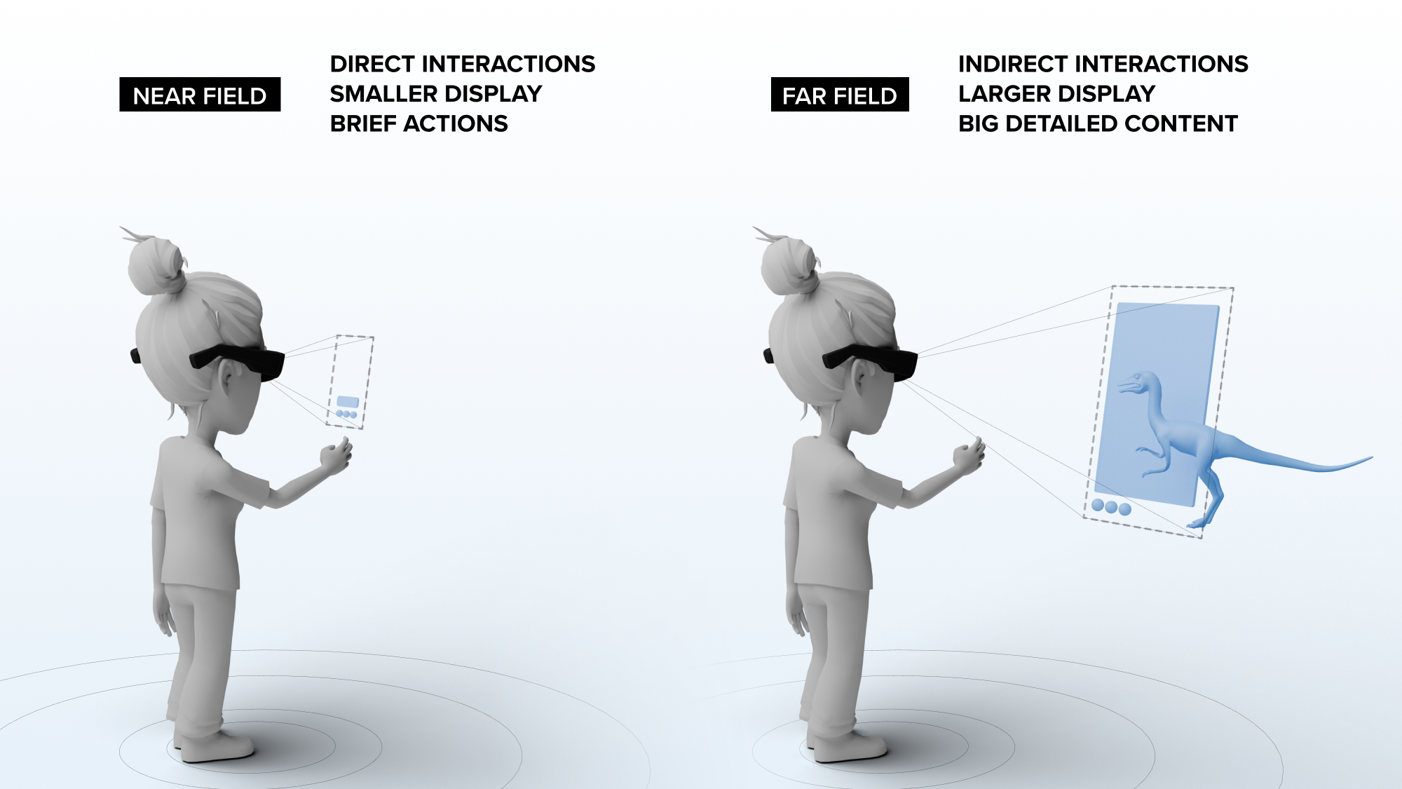
Some use cases require launching and positioning content closer to the user, while others may prefer positioning further away at the full-width convergence plane. UI elements might need to be closer than larger experiential world content. Note that the overlapping Spectacles display area becomes smaller the closer it is to the user in the Z position. Consider the following tradeoffs when deciding on a position:
Near-Field (35cm - 60cm):
- Enables direct interactions within typical human arm reach ranges
- Smaller usable display area
- Best for brief navigation and glanceable nearby controls
- Best to limit text and visual detail
- Refer to Visual Comfort for more detail
Far-Field (60cm - 160cm):
- Uses indirect interactions
- Larger usable display area
- Best for larger and more detailed content experiences that might be used for longer time periods
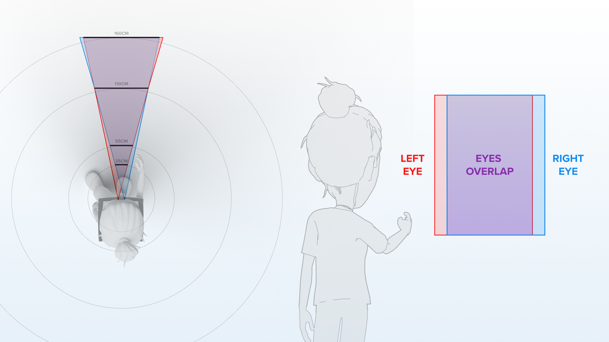
X Axis & Binocular Overlap
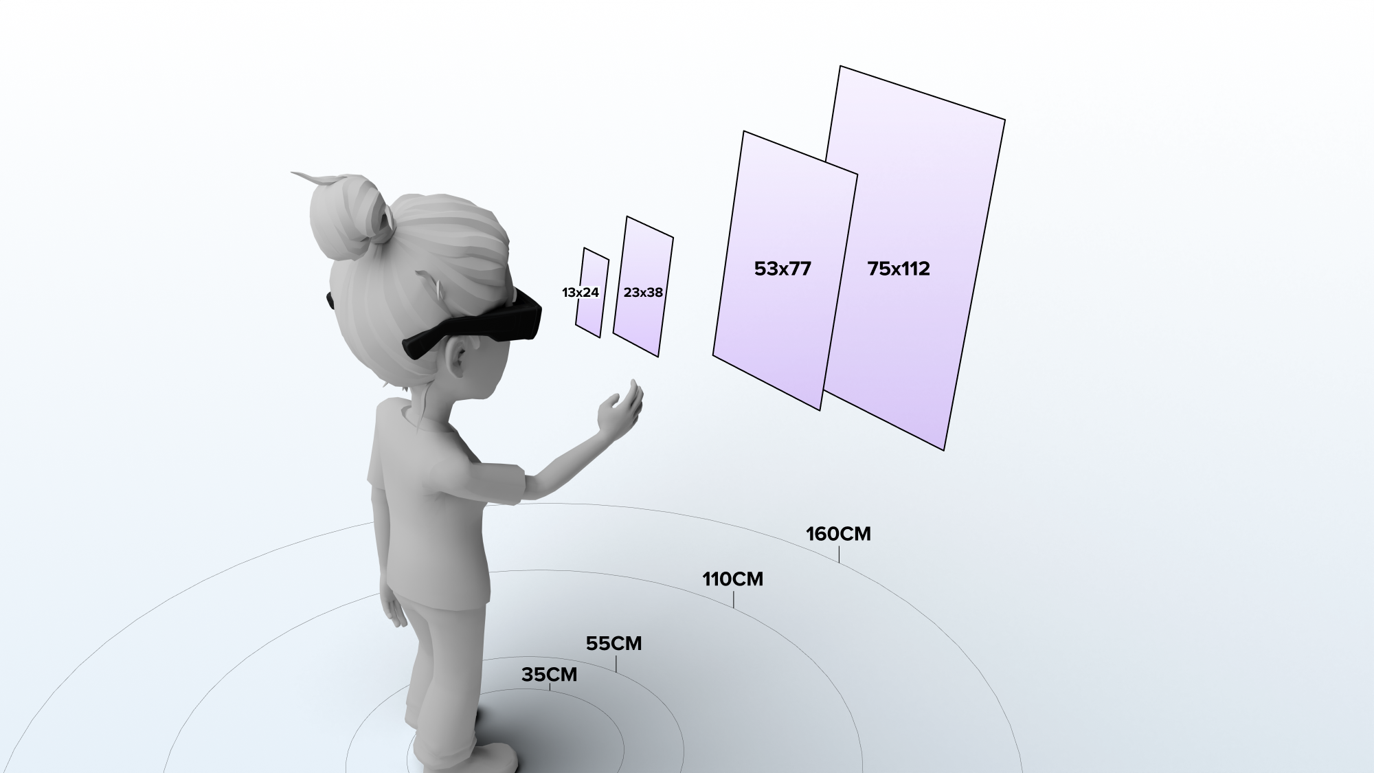
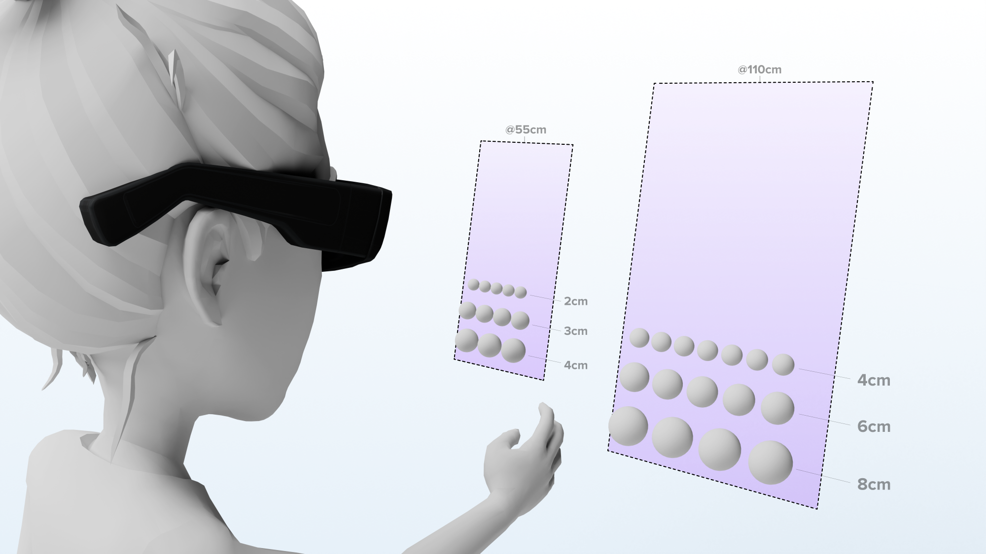
For horizontal positioning and layout, the usable display width varies based on the Z position from the user. Use the following typical Z-distances and their corresponding display sizes:
- At Z=35cm: Width X=13cm, Height Y=24cm – near field, hand anchored, quick controls
- At Z=55cm: Width X=23cm, Height Y=38cm – arm's reach for near field, quick controls
- At Z=110cm: Width X=53cm, Height Y=77cm – mid field, best default
- At Z=160cm: Width X=75cm, Height Y=112cm – far field, ultra-large if needed
For the most comfortable experience, keep your content within these recommended horizontal widths. This ensures your content remains within the binocular overlap width in any given XY plane. Avoid placing content in the monocular edges of the field of view, where only one eye can see the content, and where image quality may be lower.
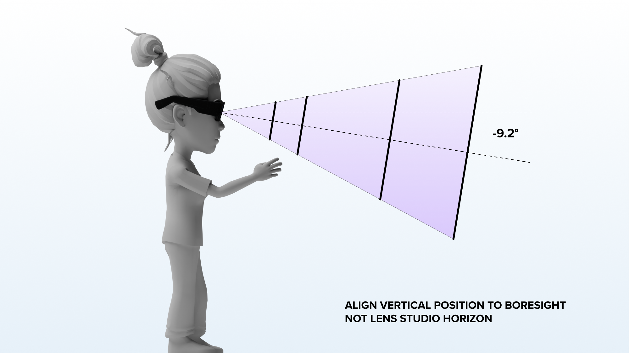
Y Axis & Boresight
For vertical positioning, consider Spectacles’ boresight angle rather than the horizon in Lens Studio. Unique to Spectacles, the display’s boresight is tilted downward to support a more neutral resting head pose. Consequently, the centerline of the display image is rotated below the horizon. This requires positioning content lower in the global coordinate space compared to publishing on a mobile device or desktop.
Center in FOV
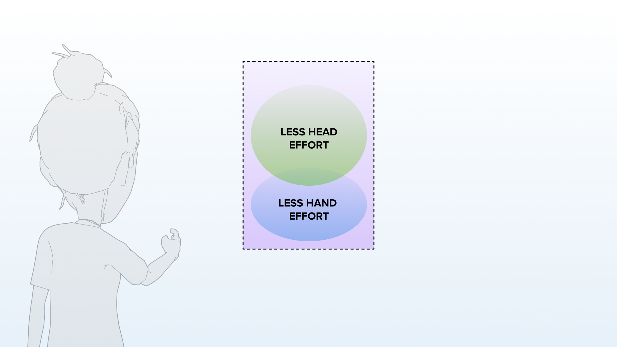
In any given XY plane, center content in the user’s field of view. This positioning provides the most comfortable and neutral head position for viewing the Lens experience, requiring minimal head movement and ensuring users see the intended content. It also avoids potential color distortion near the edges of the display. Content positioned lower in the field of view is easier to target with hand interactions.
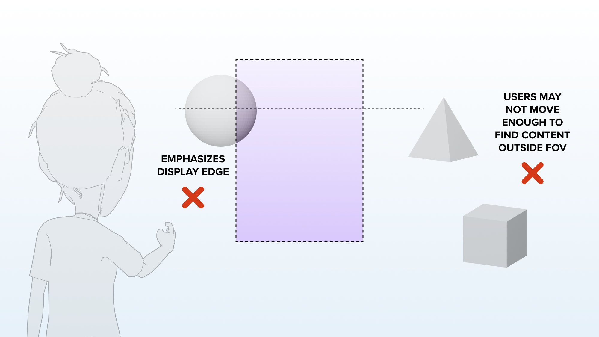
Keep content sized to fit within the field of view at any given XY plane. This approach feels more deliberate and user-friendly, making the display edges less noticeable. Content that does not fit within the field of view will feel larger than life and may be disorienting. Use this approach only if you intend to create a dramatic scale effect.
Users new to AR may not realize they can move their head to look around a Lens. If you place content outside of the field of view, users may not find it unless you specifically guide them to that content.
Button Sizing & Spacing
Size all interactive elements to support comfortable and usable hand interactions. Small buttons are difficult to target and use with hand interactions. Snap OS uses angular sizes as a distance-independent standard, which can be converted to real-world centimeters at different Z-positions. The recommended size refers to the interactive collider on an element. Visual meshes can be smaller, provided the collider meets the minimum standards for comfortable interactions. Follow these sizing guidelines:
- Targetable elements should be at least 2 degrees in angular size.
- Targetable elements should be spaced at least 1 degree apart in angular size. Spacing may also need to accommodate the size of any targeting feedback.
| Position Z = 35cm | Position Z = 55cm | Position Z = 110cm | Position Z = 160cm | |
|---|---|---|---|---|
| Minimum Size | 1.5cm | 2.0cm | 4.0cm | 5.5cm |
| Best | 2.0cm | 3.0cm | 6.0cm | 8.5cm |
| Large | 2.5cm | 4.0cm | 8.0cm | 11.5cm |
For more information, refer to Resources for a recommended sizing template. This FBX can be imported into Lens Studio or any 3D software, as a reference for recommended display sizes and target sizing at different Z-positions.