UI Design
Form & Shape
Form exists in three dimensions: height, width, and depth. Spectacles interfaces work best with a mix of 3D forms and 2D shapes.
Using 3D forms encourages hand interactions. Round geometry is more inviting to touch than flat planes with sharp edges. 3D forms provide an inherent back and some mass when viewed from different sides in 6DoF world space. They also offer more compelling interaction feedback with new motion and depth opportunities. Use 3D forms for buttons, interactive elements, and hero objects.
For legibility, use 2D shapes for text and icons to avoid extra edges that can be distracting from different angles. 2D planes and meshes can also serve as backgrounds and tiles to gather multiple 3D elements.
Performance Considerations:
- Consider the tradeoffs for your experience to balance power consumption, runtime, and visual appearance.
- Blendshapes and particle systems are power-intensive. Consider creative alternatives to simulate complex visual effects without overburdening the device.
- Optimize performance by combining meshes and using JPG masks instead of PNGs. Explore the Performance Guide for more tips.
Color & Material
Additive Color Space
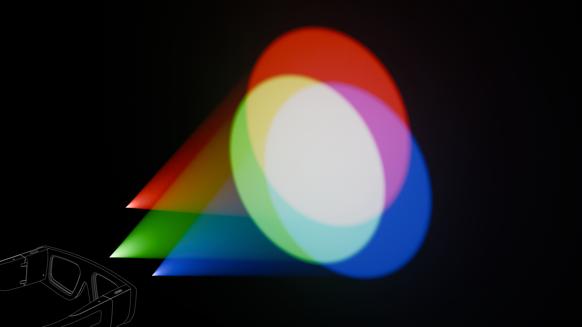
The Spectacles display system influences the appearance of colors on the device. The system uses red, green, and blue light to create AR overlays on top of the real-world view. This additive color space renders colors differently than desktop or mobile color spaces.

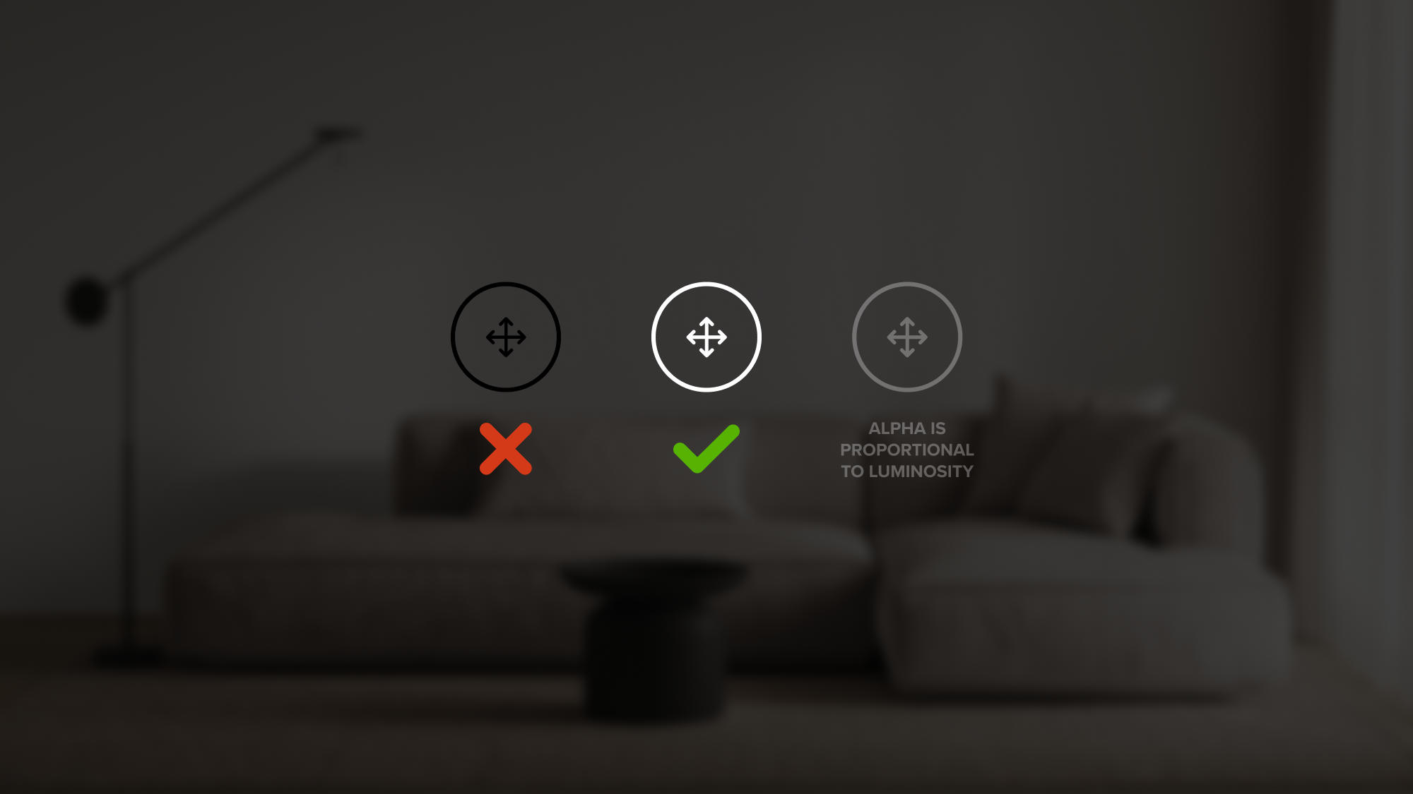
Design for Spectacles in an "inverted color space," where white is the boldest, brightest color. Alpha is proportional to luminosity; 50% alpha will be half as bright and appear as a midtone. The additive display cannot render pure black tones, which will appear transparent. Consider patterns from "dark mode" on mobile or desktop for inspiration. Test colors on Spectacles and iteratively adjust values to achieve the intended outcome.
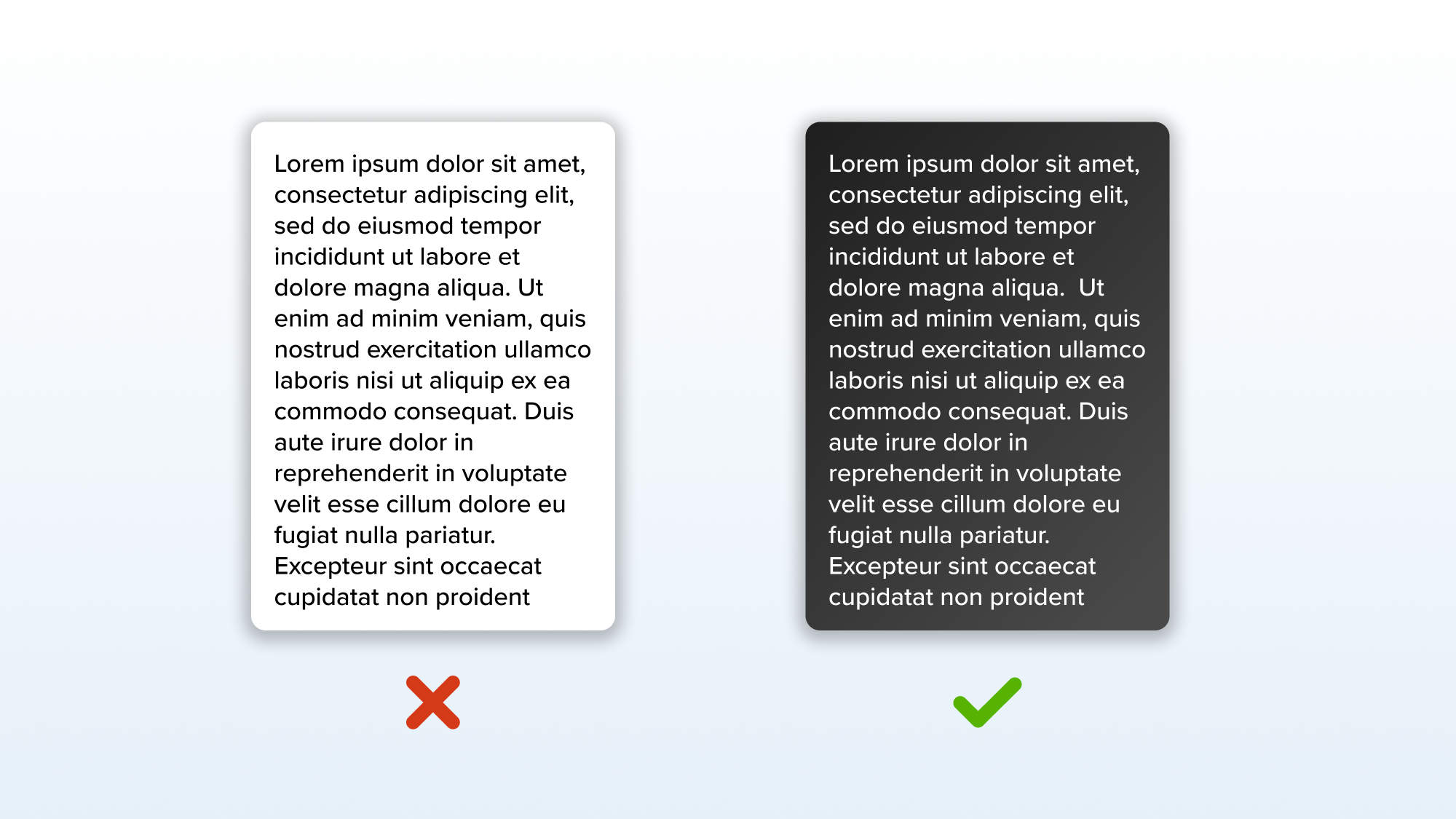
For visual comfort, avoid pure white backgrounds with dark text, as this is less comfortable to read than dark backgrounds with lighter text. Uniform color regions may highlight display variations and non-uniform color rendering. Use patterns or subtle background textures to minimize these display variations.


Materials
Consider the tradeoffs for your experience to balance power consumption, runtime, and visual appearance.
- For efficient performance, use unlit materials with baked-in lighting and simple shaders to mimic PBR effects. This approach reduces the computational overhead of detailed environment maps.
- Avoid gradients with opacity to minimize texture load and graphical artifacts.
- Use black/white masks for occlusion effects instead of more resource-intensive occlusion shaders.
Motion
Use motion design to guide the user’s attention from one point to another. In 3D space, this is particularly useful for wayfinding and orienting users.
- Motion can cue an origin point and ease transitions between dynamic elements. This is especially helpful when opening world content from the hand or transitioning content from smaller menus to larger positions in the world. Use motion to direct the user’s attention to a new position.
- Motion can also provide interaction hints as feedforward and feedback, offering moments of delight and an opportunity to express a particular stylistic language.
Examples:
- Snap OS palm UI jiggles and flexes to hint at a poke action.
- Snap OS pinch buttons hint at their pinch action with a progressive “squish” animation.
- Lens Explorer tiles move forward in z-depth to indicate they have been targeted.
- Video Calling presence expands upwards to guide the user’s attention.
Spatial Audio
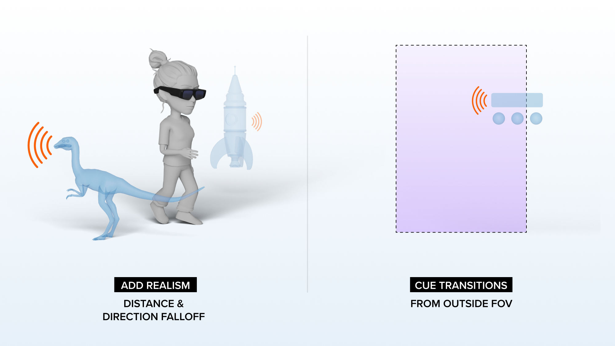
Spatial audio offers new creative opportunities for AR experiences. Sound sources can be positioned in the real-world scene with realistic distance and directional behavior relative to the user’s movement through the scene, allowing the user to “hear what they see”.
Spatial audio enhances realism and immersion, making the digital scene feel more plausible, as if it were part of real life. It can also serve as a directional cue to grab the user’s attention and signal where content may appear from a specific direction, such as outside the field of view.

Learn More:
Resources
- Snap OS 2.0 Design Kit - Figma component library with tokens, styles, components, and reference screens for designing Spectacles interfaces