Camera Roll Widget
The custom component allows Snapchat users to select multiple photos from their Camera Roll. These images can then be used for collages, transitions, randomizers - use it whenever you want to keep track of what the user selected.
Adding the Component to a Scene
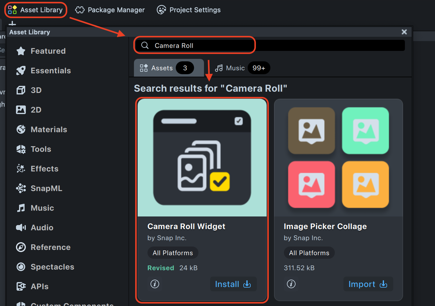
The Camera Roll Widget component can be downloaded from
the Asset Library. Once
installed, you can add it to your project from the Asset Browser panel by clicking the + button and searching for
Camera Roll Widget.
Inputs
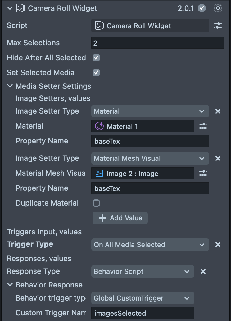
The component’s behavior can be customized through the following inputs in the Inspector panel.
| Input | Type | Description |
|---|---|---|
| Max Selections | number | Maximum number of photos or videos a user can select at once (range: 2–20). |
| Media Type | enum | The type of media to be displayed in the media picker: "Images and Videos", "Images", or "Videos". When the value is changed, the media picker will be refreshed automatically. |
| Hide After All Selected | boolean | If enabled, the camera roll closes automatically after the user selects the maximum number of items. |
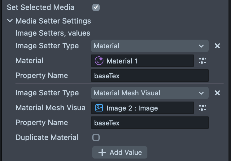
| Set Selected Media | boolean | If enabled, displays selected photos or videos on a scene object using the Media Setter. |
| Media Setter Input | MediaSetterInput | Specifies which objects display the selected media. Visible only if "Set Selected Media" is enabled. |
| Triggers Input | TriggerStrategyInput[] | Defines automatic actions triggered by user interactions, e.g., when a photo is selected. |
| Print Warnings | boolean | If enabled, shows helpful console messages when something isn't working correctly. |
| Print Debug Messages | boolean | If enabled, displays extra debug information for troubleshooting. |
Media Setter Input
This section specifies the target object for displaying selected media when Set Selected Media is enabled.
| Input | Type | Description |
|---|---|---|
| Image Setter Type | enum | Type of object to display media on: Material, MaterialMeshVisual, VFXAsset, or VFXComponent. |
| Material | Material | Select the material if "Material" is chosen. |
| Material Mesh Visual | MaterialMeshVisual | Select the mesh if "MaterialMeshVisual" is chosen. |
| VFX Asset | VFXAsset | Select the asset if "VFXAsset" is chosen. |
| VFX Component | VFXComponent | Select the component if "VFXComponent" is chosen. |
| Property Name | string | Name of the texture property to change (default: baseTex). |
| Duplicate Material | boolean | If using "MaterialMeshVisual," this creates a copy of the material before applying the new texture. |
Trigger Strategy Input
Defines automated actions based on user interactions with the camera roll. You can add multiple trigger strategies.
| Input | Type | Description |
|---|---|---|
| Trigger Type | enum | Event that starts the action: OnSingleMediaSelected, OnSingleMediaDeselected, OnAllMediaSelected, or OnSelectionChanged. |
| Responses | ResponseStrategyInput[] | Actions to perform when the trigger event occurs. |
Response Strategy Input
Specifies the action performed when a trigger event occurs.
| Input | Type | Description |
|---|---|---|
| Response Type | enum | Type of action: BehaviorScript, Tween, or CustomScriptApi. |
| Behavior Response Type | enum | Method for triggering the behavior: GlobalCustomTrigger or ManualTrigger. (Visible if Response Type is BehaviorScript). |
| Custom Trigger Name | string | Name of the trigger. (Visible if Behavior Response Type is GlobalCustomTrigger). |
| Behavior Script | ScriptComponent | The target behavior script. (Visible if Behavior Response Type is ManualTrigger). |
| Tween Script | ScriptComponent | The script containing the tween to play. (Visible if Response Type is Tween). |
| Custom Script | ScriptComponent | The script containing the function to call. (Visible if Response Type is CustomScriptApi). |
| Method Name | string | Name of the function to call in your custom script. (Visible if Response Type is CustomScriptApi). |
Scripting API
To interact with the Camera Roll Widget from your own scripts, you can use its public API. It provides several events and methods to control the widget and respond to user selections.
Properties
| Name | Type | Description |
|---|---|---|
mediaType | MediaType enum | Specifies the type of media to be displayed in the media picker. When the value is changed, the media picker will be refreshed automatically. |
Methods
| Method | Description |
|---|---|
show(): void | Shows the media picker to the user with the configured options. |
hide(): void | Hides the media picker and clears all current selections. |
Events
You can subscribe to events to trigger custom logic based on user interaction.
| Event | Payload | Description |
|---|---|---|
allMediaSelectedEvent | CameraRollMedia[] | Triggered when all media slots (up to maxSelections) have been filled. |
selectedMediaUpdateEvent | CameraRollMedia[] | Triggered whenever the selection of media changes (an item is selected or deselected). |
singleMediaSelectedEvent | CameraRollMedia | Triggered when a single piece of media is selected by the user. |
singleMediaDeselectedEvent | CameraRollMedia | Triggered when a single piece of media is deselected by the user. |
Example
Here’s how you can use the API to show the picker and listen for various events:
import { CameraRollWidget } from 'Camera Roll Widget.lsc/Camera Roll Widget';

@component
export class Test extends BaseScriptComponent {
  @input
  private readonly cameraRollWidget: CameraRollWidget;

  onAwake() {
    this.cameraRollWidget.singleMediaSelectedEvent.subscribe(
      (media: CameraRollMedia) => {
        print('Single media selected: ' + media.mediaId);
      }
    );
    this.cameraRollWidget.singleMediaDeselectedEvent.subscribe(
      (media: CameraRollMedia) => {
        print('Single media deselected: ' + media.mediaId);
      }
    );
    this.cameraRollWidget.allMediaSelectedEvent.subscribe(
      (media: CameraRollMedia[]) => {
        print('All media selected: ' + media.map((m) => m.mediaId).join(', '));
      }
    );
    this.cameraRollWidget.selectedMediaUpdateEvent.subscribe(
      (media: CameraRollMedia[]) => {
        print(
          'Selected media updated: ' + media.map((m) => m.mediaId).join(', ')
        );
      }
    );
  }
}
Types and Enums
MediaType enum
enum MediaType {
  ImagesAndVideos,
  Images,
  Videos,
}
ImmutableEvent<T>
An object that allows you to subscribe to and unsubscribe from an event. The generic type T is a tuple representing
the arguments passed to the listener.
| Method | Signature | Description |
|---|---|---|
subscribe | (listener: (...args: T) => void): Subscription | Subscribes a listener to the event. Returns a Subscription object. |
unsubscribe | (listener: (...args: T) => void): void | Unsubscribes a listener from the event. |
Subscription
An object with a dispose() method to stop listening to an event.
| Method | Signature | Description |
|---|---|---|
dispose | () => void | Removes the event listener associated with this subscription. |