Image Carousel
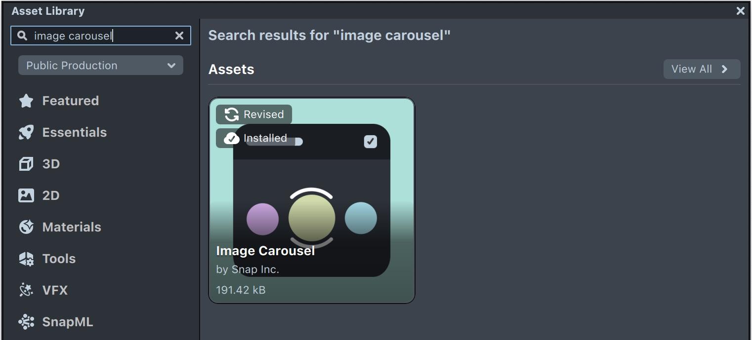
Image Carousel is a rotary UI element that enables the selection of one item between many. To select items users can swipe to rotate the carousel or tap on an icon.
Adding the component to a scene
The Image Carousel component can be downloaded from the Asset Library.

Once downloaded it can be added to a Scene Object that has a Screen Transform.
Typically, the Orthographic Camera responsible for rendering the Image Carousel includes a Canvas component. To ensure the Image Carousel appears at the correct size, the Unit Type field of the Canvas component should be set to World. If not, the carousel may display as too small.
Adding items
Items are added to the carousel by adding to the "Images" input array. Click on “Add Value” and select or drag a texture to the newly created field. (Items can be also added through a script using the API, see Full API section below)
Defining touch area
The carousel responds to touch events inside the bounds of its containing Screen Transform, editing these bounds will determine the touch area for the component.
The carousel can be also modified to have a vertical orientation (or any diagonal orientation) by rotating the containing Scene Object. Item images can then be straightened using "Item Rotation" input (under “Advanced”).
Responding to selection events
Responding to selection events can be done in one of two ways - registering for the onSelectionUpdate event or setting the callback input fields.
Method 1: Register for "onSelectionUpdate" event
The carousel component has an event called onSelectionUpdate that is triggered whenever a selection is made. Scripts can register for this event in the following way.
Create a new script with the following code:
//@input Component.ScriptComponent carousel

script.carousel.onSelectionUpdate.add(function (i, tex) {
  print('selected index: ' + i);
  print('selected icon texture: ' + tex);
});
Add the script to your scene and use the Inspector panel to set the "carousel" input field to reference the carousel component in the scene.

Method 2: Set callback input fields
Create a new script and define the following function:
// Image Carousel callback example

script.onCarouselSelection = function (i, tex) {
  print('selected index: ' + i);
  print('selected icon texture: ' + tex);
};
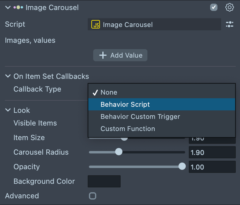
In the Carousel CC, set the input fields under "On Item Set Call":
-
Script: Set to the newly created script (the script should be in the scene).
-
Function Name: Set to the name of the function that should be called when a selection is made ("onCarouselSelection" in this example).

Inputs
The Image Carousel Custom Component provides various input parameters to customize its look and feel. See below the full list of inputs:

| Input Name | Description |
|---|---|
| Images | Array of textures, will be used as the icons of the items |
| On Item Set Call | Defines the callback to call when selection is made |
| Visible Items | Set the number of visible items (3 or 5) |
| Item Size | The size of the items |
| Carousel Radius | The radius (spread) of the carousel |
| Opacity | The opacity of the items |
| Background Color | The color to use for the background of the carousel (default is transparent) |
| Ring Margin | The distance between the selection ring and the selected item |
| Item Rotation | Internal rotation of the item images |
| Render Order | Render order of this UI (higher value will render later in the scene, leave at 0 to render in the same order as the containing Scene Object) |
| Touch Sensitivity | Sets swipe sensitivity, higher value is more sensitive |
| Magnet Force | The magnitude of the force that centers the carousel on the closest item. Used for the animation |
| Inertia Force | The inertia magnitude on quick swipes |
| Delay Callback | Can be used to set a delay from the time of selection until the selection event is called |
Full API
Events
onSelectionUpdate(index, texture)
index is the index of the item in the carousel
texture is the texture of the icon that was selected
Registering for the event from another script:
script.carouselCC.onSelectionUpdate.add(function(index, texture) {...});
Functions
| Method | Description |
|---|---|
size(): int | Returns the number of items in the carousel. |
setSelected(int index, bool animate): void | Selects the item at the given index and animates to position if animate is true. |
getSelected(): int | Returns the currently selected item index, or -1 if the carousel is empty. |
getCentered(): int | Returns the item index closest to the center (works while dragging/animating too). May differ from the currently selected item while rotating the carousel. |
add(Texture image): int | Adds an item to the end of the carousel with the specified image. Returns the new image index. |
remove(int index): bool | Removes the image at the specified index. Returns false if the index is out of bounds. |
setImage(int index, Texture image): bool | Sets the image at the specified index. Returns false if the index is out of bounds. |
getImage(int index): Texture | Returns the image texture for the specified index, or null if the index is out of bounds. |
getSelectedImage(): Texture | Returns the currently selected image texture, or null if the carousel is empty. |
setLocked(int index, bool locked): void | Shows/Hides a lock badge on the icon at the specified index. |
getLocked(int index): bool | Gets the lock badge state for the icon at the specified index. |
setData(int index, Object data): void | Sets private data associated with the icon at the specified index. |
getData(int index): Object | Gets private data associated with the icon at the specified index. |
enableInteraction(): void | Enables touch interaction. |
disableInteraction(): void | Disables touch interaction. |
show(): void | Shows the carousel with a fade-in animation. |
hide(): void | Hides the carousel with a fade-out animation. |
isVisible(): bool | Returns the visibility state of the carousel. |
Example
Here’s an example script that calls some of the carousel API functions
//@input Component.ScriptComponent carousel

//@input Asset.Texture[] icons

// Add items to the carousel

for (let i in script.icons) {
  script.carousel.add(script.icons[i]);
}

// Set currently selected item
script.carousel.setSelected(1);

// Get currently selected item
print('Selected index: ' + script.carousel.getSelected());