Soundboard
The Soundboard example allows you to create your very own soundboard Lenses! This Lens example features a set of buttons that each trigger a different sound and popup graphic.
The buttons in Soundboard Example Lens will show during recording allowing the user to press them but won't be rendered in the final Snap. It does this by using a unique Capture Target and Live Target. Refer to the Camera and Layers guide for more information on showing things during recording but not having them be in the final Snap.
Getting the Example
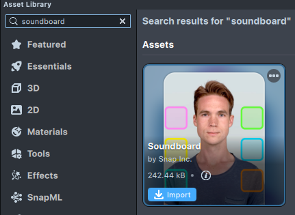
Open the Asset Library and look for the Soundboard asset.
Once you import the asset from Asset Library, you can find the package Soundboard in the Asset Browser.
Follow the instructions and drag the prefab Soundboard into Scene Hierarchy to create a new Scene Object.
You can right-click and select Unpack for Editing from the drop-down menu to unpack all assets stored in the bundle. Click here to learn more about Asset Packages. Once you unpack the package, you can then edit its content.
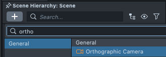
If your project doesn't have an Orthographic Camera (i.e. to render 2D content in screen space), you can add it by pressing + > Orthographic Camera in the Scene Hierarchy panel.
Exploring The Example
Once you have the project open, you’ll see a set of buttons in the Preview panel. Try clicking on these buttons in the Preview panel to see what they do.
You should see that each button triggers a different sound and kitty visual.
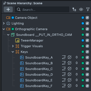
The Soundboard Keys
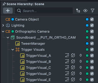
The sounds and visuals triggered by the buttons are controlled by a group of SceneObjects. You can see them in the Scene Hierarchy panel, named with the prefix “SoundboardKey_”.
Adding Custom Sounds
To edit the sound played by a button, start by selecting its corresponding “SoundboardKey_” object in the Scene Hierarchy panel.
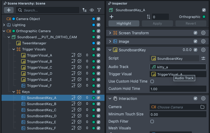
The selected object has a SoundboardKey script. You can change the sound it plays by editing the Audio Track property on that script component.
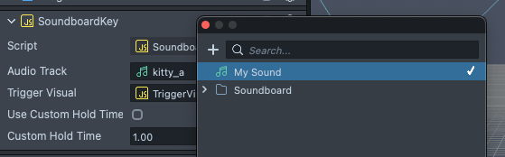
To bring in your own audio track, in the Asset Browser panel, select + -> Import Asset.
You can also drag your files into the Asset Browser panel to import them.
Editing The Buttons
Similarly, you can change the appearance of the buttons by editing the button’s Material, which you can find in the Asset Browser panel under Materials.
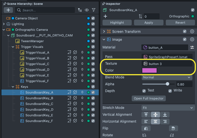
To bring in your own image, in the Asset Browser panel, select Add New -> Import Files. Learn more in the import guide.
You’ll likely only need to adjust the Base Color and Base Texture properties.
The Trigger Visuals
The Kitty visuals you see popping in after each button press are also SceneObjects, named with the prefix “TriggerVisual_”.
Adding Custom Visuals
To replace the image displayed on one of the popup visuals, start by selecting its corresponding �“TriggerVisual_” object in the Scene Hierarchy panel.
Like before, the selected object has a Image component. You can change its image by editing the Texture property on the Image Component's material.
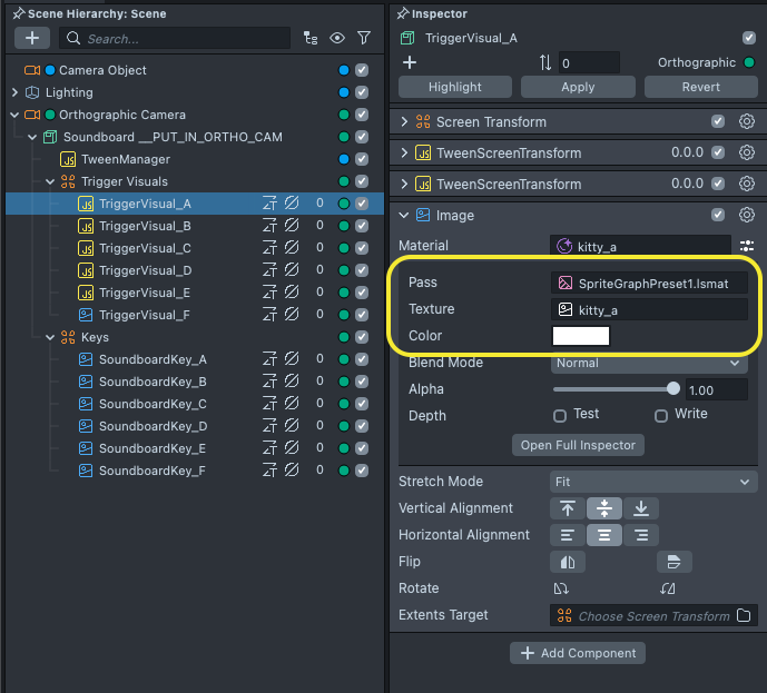
You can collapse components to find the ones you're looking for by clicking on the arrow next to their name. For example, collapsing Screen transform and TweenScreenTransform can help you find the Image component.
Updating The Motion
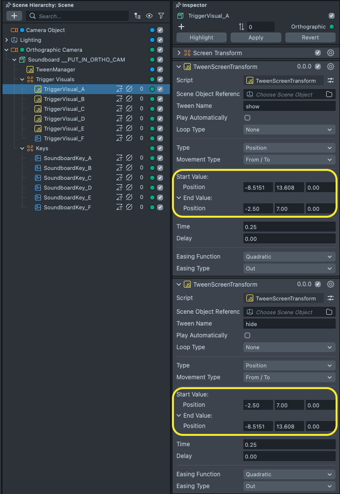
Each of the TriggerVisual objects has its own predefined tweens for entering and exiting the frame. You can adjust these settings by editing the TweenScreenTransform script components attached to the “TriggerVisual_” objects.
To edit the visual’s start position, edit the Start property on the Tween named “show”, and edit the End property on the Tween named “hide.”
To edit the visual’s end position, edit the End property on the Tween named “show”, and edit the Start property on the Tween named “hide.”
To learn more about how the Tween system works, visit our documentation on Tweening.
Previewing Your Lens
You're now ready to preview your Face Lens. To preview your Lens in Snapchat, follow the Pairing to Snapchat guide.