What x Are You Spinner
Spinner Lenses, such as "What ___ are you?", is a popular Lens type that allows a Snapchatter to be randomly assigned some content. For example: a "What fruit are you" spinner will randomly give the Snapchatter some content like: "orange", "apple", "peach" and so forth.
The "What ___ Are You?" template allows you to build your own unique spinner Lens by simply providing a list of words, images, colors, or a combination of them!
Using the Template
The template comes with two ways to build your spinner:
- Option A allows you to modify the look of your spinner by changing some toggles and values in one central place so you can iterate quickly.
- Option B allows you to completely customize the look of your spinner, by editing your visuals directly, with all the power of Lens Studio.

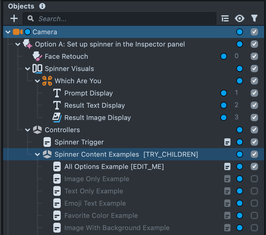
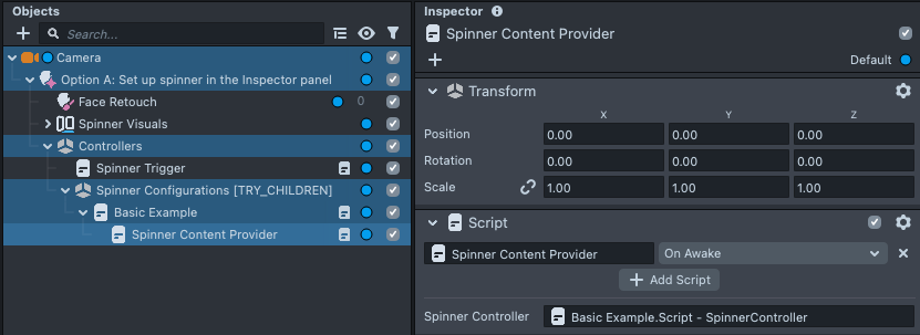
You can find these options in the Objects panel. Toggle the checkbox next to each option to activate them. You should use only one option so that you don't get two overlapping spinners!
You can see various example spinners by toggling the checkboxes underneath the [TRY_CHILDREN] object, in the Option A section of the Objects panel.
Configuring your Spinner
Preparing your spinner
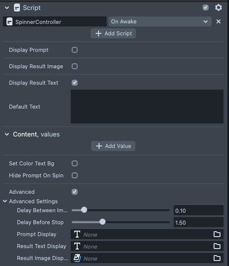
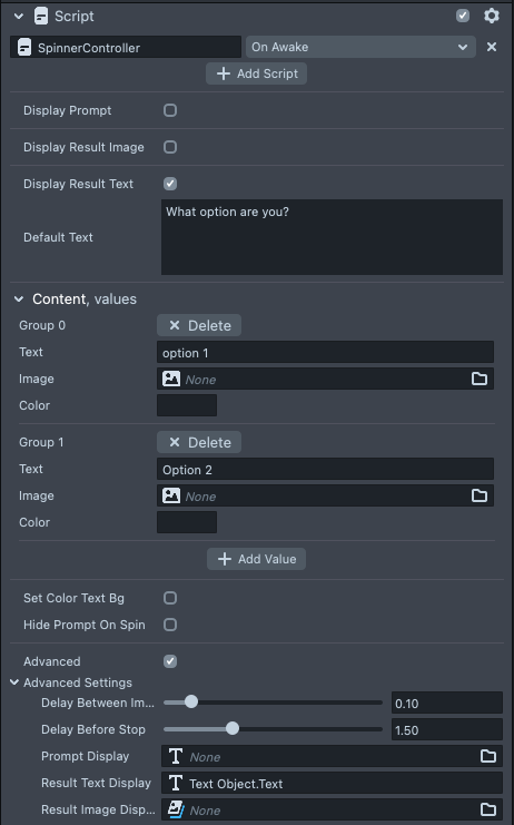
To configure your spinner, select the Spinner Content object in the Objects panel, which contains the Spinner Controller. In the Inspector panel, you can change what your spinner displays.
There are three key placeholders that the spinner can use
- Prompt: tells the user what the spinner is about.
- Result Image: the place where the randomly selected image will be shown.
- Result Text: the place where the randomly selected text will be shown.
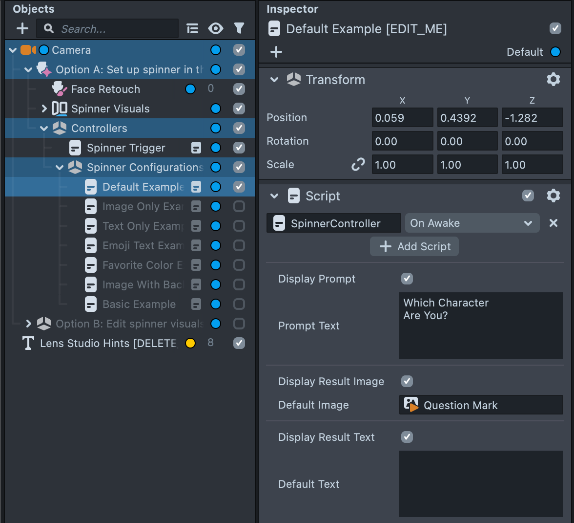
If you don't need all these placeholders, you can toggle their respective checkbox:
Adding content to your spinner
In the Content section of the Spinner Controller you can add the options that the spinner will roll through.
Press the + Add Value button to add new options.

Each option comes with a Text, Image, and Color field.
- The
Textfield will populate theResult Textplaceholder. - The
Imagefield will populate theResult Imageplaceholder. - The
Colorfield will set the background of theResult Textplaceholder.
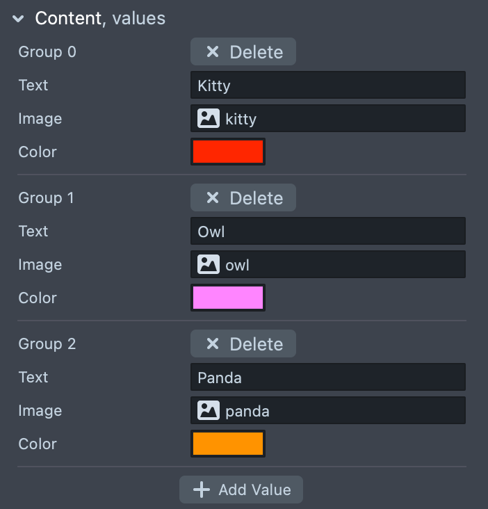
You don't need to set a value for every field, but it's best to be consistent across all your options.
Setting the background color of the Result Text field can be useful to add a background color to your image--see the Image with Background Example. Here we use a "white-space" character (such as ), to display some color.
Configuring the spinner's behavior
There are some options you can consider, depending how you want your spinner to work:
- Set Color Text BG allows you to change the
Result Text's background color based on an option'sColorfield. - Hide Prompt on Spin allows you to hide the prompt when an option is being presented to allow the user to focus on the result.

Make sure to consider whether a person receiving a Snap would get what your spinner is about, especially if you hide the prompt on spin!
Triggering the spinner
By default, the spinner runs on tap and when the user opens their mouth. You can change this in the Spinner Trigger object.
With Spinner Trigger selected in the Objects panel, in the Inspector panel, look for the Trigger field.
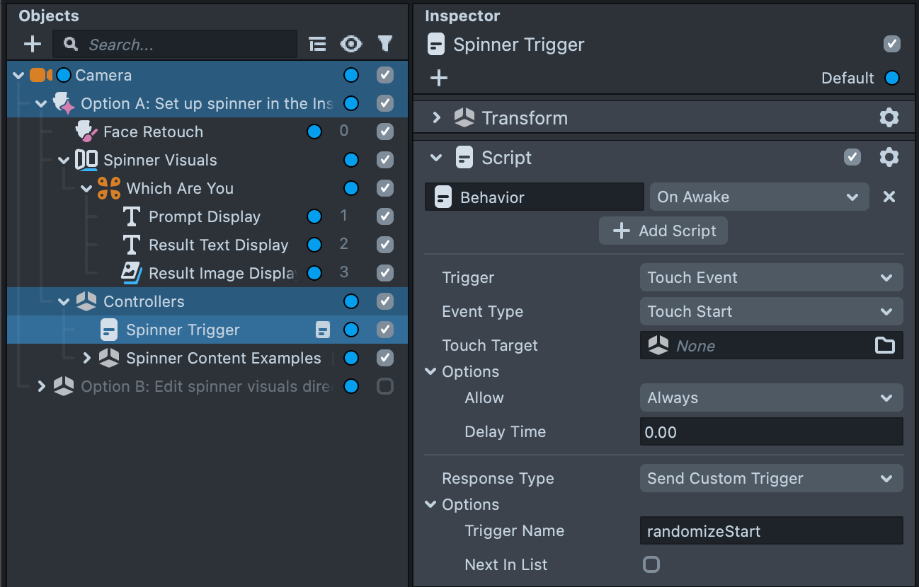
If you change the Spinner's trigger, make sure you help the user know! Press the Project Info button to choose the Hint you want your Lens to show!
Notice how there are two Behavior scripts. One for the tap event, the other for the mouth event. They both Send Custom Trigger to randomizeStart, which is actually what calls the Spinner Controller. You can add more triggers by adding another Script component and using the Behavior script.
Modifying the Look of Your Spinner
Customizing when using Option A
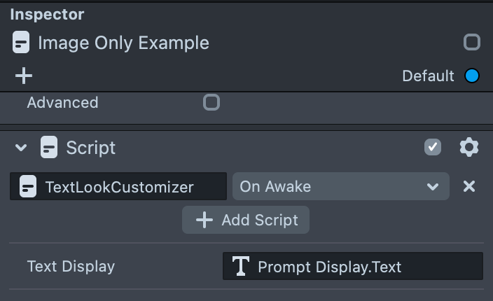
When using Option A, the look of the spinner is defined in the Text Look Customizer script below the Spinner Controller script.
For example, notice below how there is a Text Look Customizer whose Text Display field is a reference to the aforementioned Prompt Display.
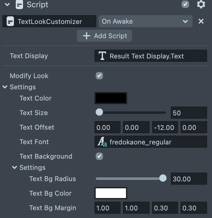
For example: If you are using the Set Color Text BG option in the Spinner Controller, you can define how the background looks by toggling Text Background then changing Text Bg Radius and Text Bg Margin, for the Text Look Customizer with a reference to Result Text Display.
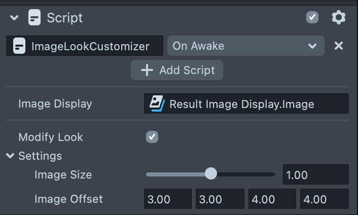
Similarly, the Result Image Display is modified by the Image Look Customizer which has Result Image Display as a reference in the Image Display field. For example, you might shift the position of the image by changing the numbers next to Image Offset (in order, the number represents: left, right, bottom, top).
Customizing when using Option B
In fact, the Look Customizer script is simply a shortcut to the actual settings of each text / image placeholder!
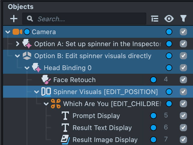
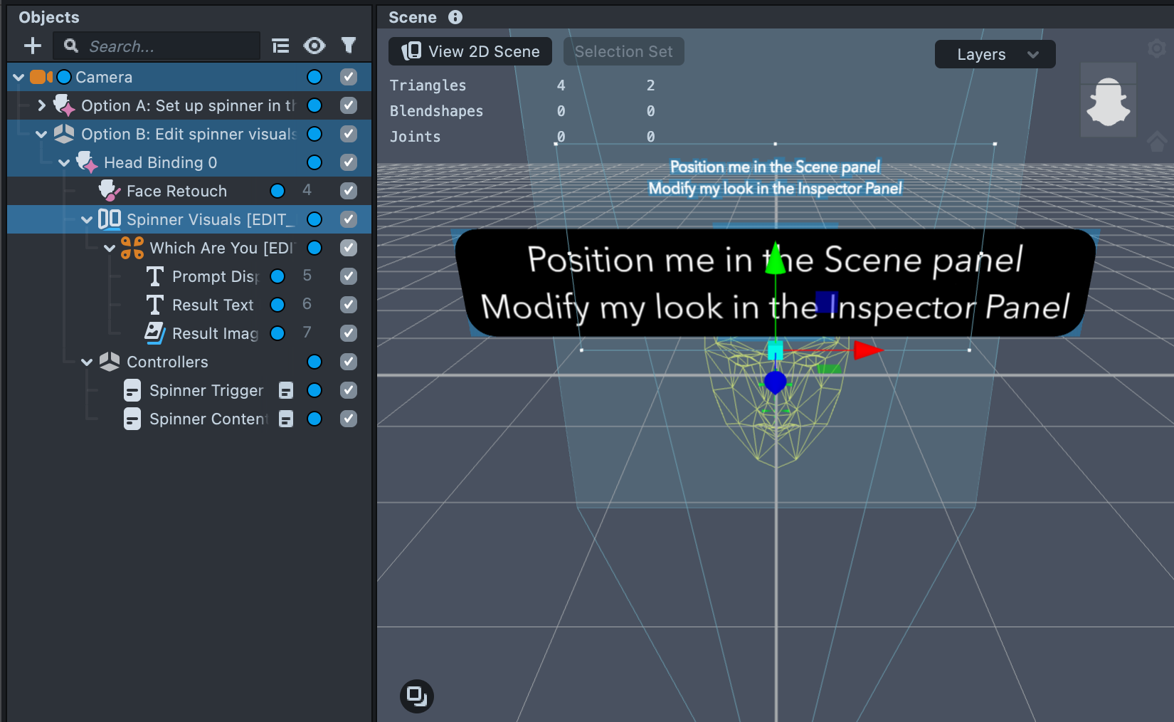
If you look at Option B, you can see the Spinner Visuals object is expanded. You can select each object to modify how the spinner looks!
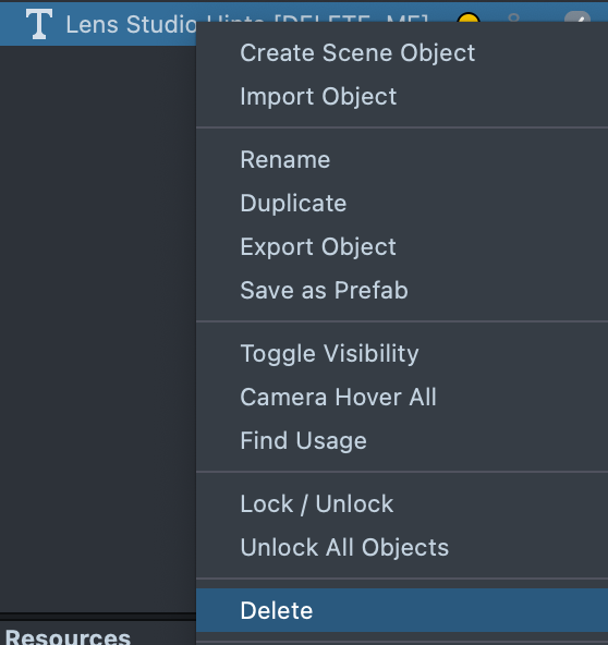
Make sure to delete the Lens Studio Hints object so you can see your objects in the Scene panel clearly:
If you wanted to modify the position of the Spinner, you can select Spinner Visuals in the Objects panel, then in the Scene panel, you can select the move widget (w on the keyboard), and move the visual.
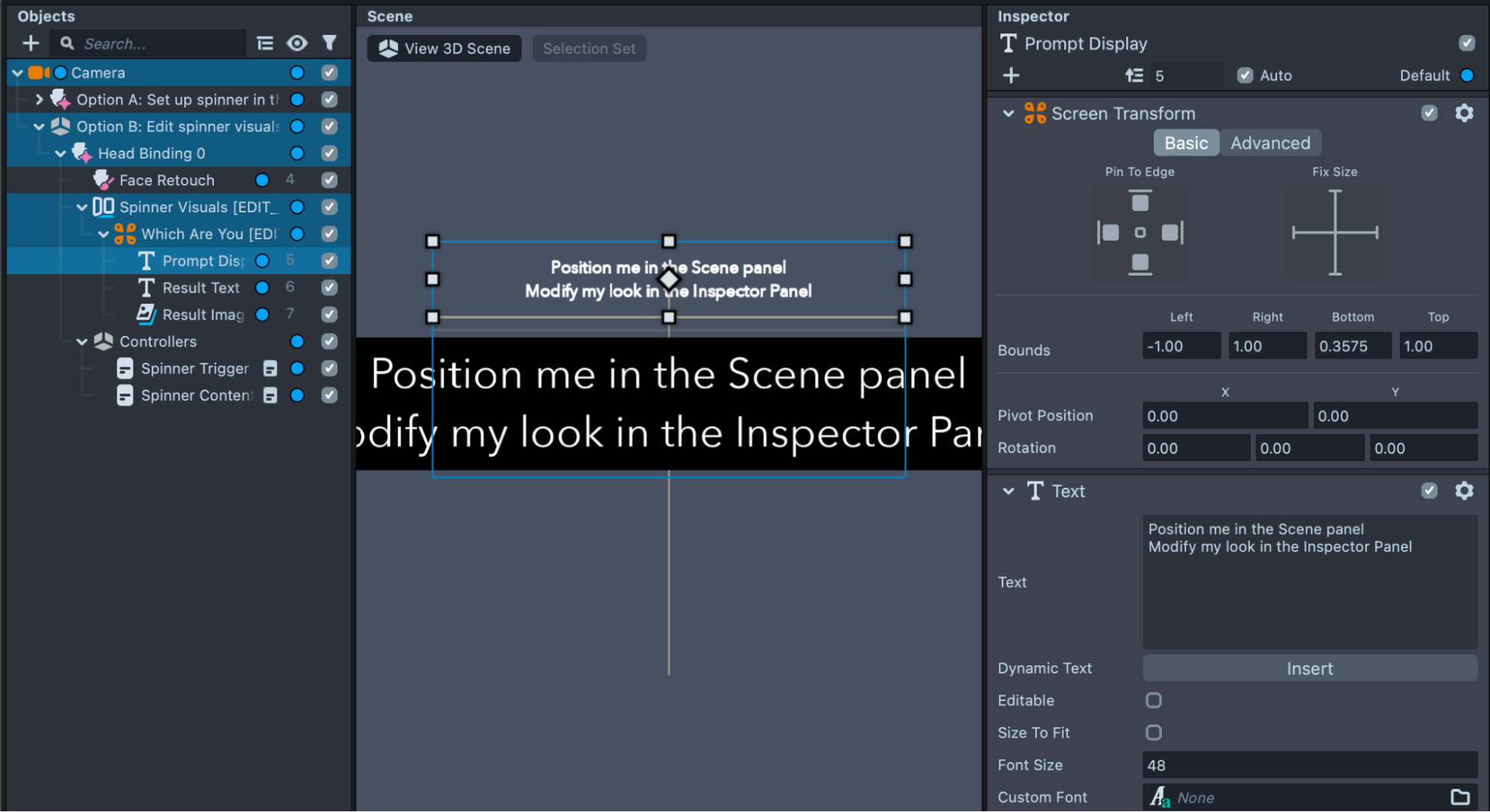
You can select the individual displays (e.g. Prompt Display) in the Objects panel, and modify its setting in the Inspector panel. For example, just as in Option A, you can change the display's color, by clicking on the field next to the Color field.
Adding a Spinner to an existing Lens
Since the template is just composed of several Asset Library scripts, you can add a Spinner to any Lens.
The SpinnerController.js is the script that controls the spinner’s behavior. You can connect any Image or Text component to this script to create your Spinner.
To add the Spinner Controller script to an object: Create a new object by going to the Objects panel > + > Scene Object. With the new object selected, in the Inspector panel, press + Add Component, Script. Finally, press + Add Script, and choose the Spinner Controller in the popup.
You can add a new display by going into the Objects panel > + > Text Object

Then, you can link the new object and configure your spinner as usual!
You can do the same for Prompt Display, and Result Image Display as you need it!
Adding content via a script
It is also possible to add content to the spinner via a script. This is useful if you want to quickly change the data.
You can create a script:
// @input Component.ScriptComponent spinnerController

script.spinnerController.promptText = 'Default Prompt';
script.spinnerController.defaultText = 'Default Result';
script.spinnerController.content = [
  {
    text: 'option 1',
    color: new vec4(1, 0, 0, 1),
  },
  {
    text: 'option 2',
    color: new vec4(0, 1, 0, 1),
  },
  {
    text: 'option 3',
    color: new vec4(0, 0, 1, 1),
  },
];

// Update the visuals of the spinner to match the new content
script.spinnerController.initVisuals();
Then, add it to an object, and put a reference to the Spinner Controller you are using.
Previewing Your Lens
You’re now ready to preview your Lens! To preview your Lens in Snapchat, follow the Pairing to Snapchat guide.
Related Guides
Please refer to the guides below for additional information: