Media Picker
The Green Screen template demonstrates the Media Picker Texture, which enables a Lens to display an image or video from the user’s device. The template includes multiple examples such as using a Segmentation texture to display the user’s media behind the user and how to place the media in a designated area.
Guide
By default, the template displays the picked media through the Background Image object.
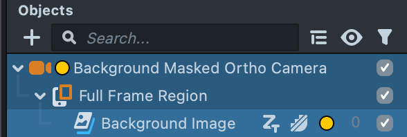
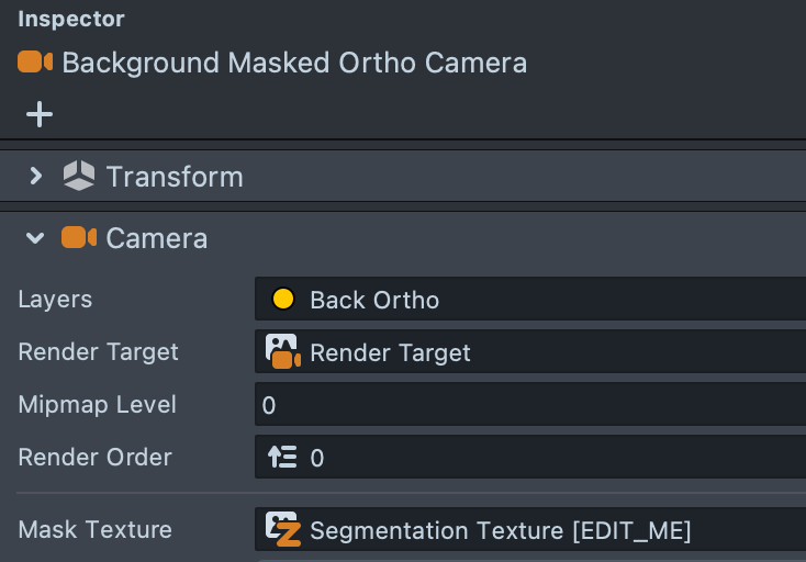
This media is masked so the user appears in front of it by the Mask Texture option in the Background Masked Ortho Camera object.
For more information on Segmentation textures, see the Segmentation Guide.
You can modify how the image is displayed through the Scene panel by clicking on the gray boxes.
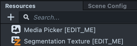
To modify the displayed media and the content that is masked, modify the Media Picker and Segmentation Texture in the Resources panel.
To start working with templates, see the EDIT_ME resources in an object or template.
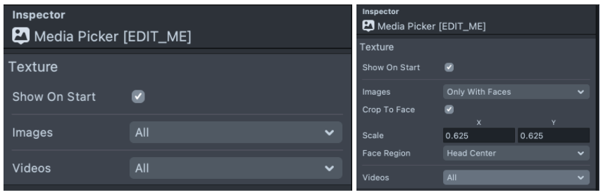
For example, you can filter the type of media that the user can choose from such as only images, only videos, only images with faces, or some combination of these.
For more information, see the Media Picker guide.
Adding Content on Top of the User
In many cases, you’ll want to add content on top of the user to tell a story. This template comes with two examples.
Adding 3D Content
You can place 3D objects under the Front Camera object. The main difference between the Background Masked Ortho Camera and the Front Camera is that this camera does not have its Mask Texture set, so content on this camera is not occluded by the user.
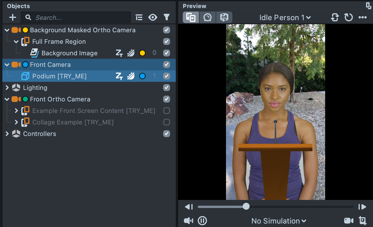
In the Objects panel, notice that the colored dots to the right of the Podium object match the colored dots to the left of the Front Camera object. These colored dots represent the layer the object is displayed on and the layer the camera is rendering. For more information, see the Camera and Layers Guide.
To hide the colored dots, click the Eye icon next to the Search Bar in the Objects panel, and then select Layer.
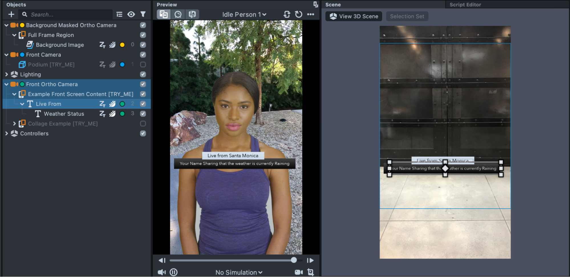
Adding 2D Content
See this example under the Front Ortho Camera. Example Front Screen Content shows how to display 2D content above the user. This camera is a standard Orthographic camera (like the ones you get when adding a Screen Image). Like the Front Camera, it does not have any Mask Texture on the camera, so the content is not occluded by the user.
Note the colored dots on the text object matches the one next to the camera object.
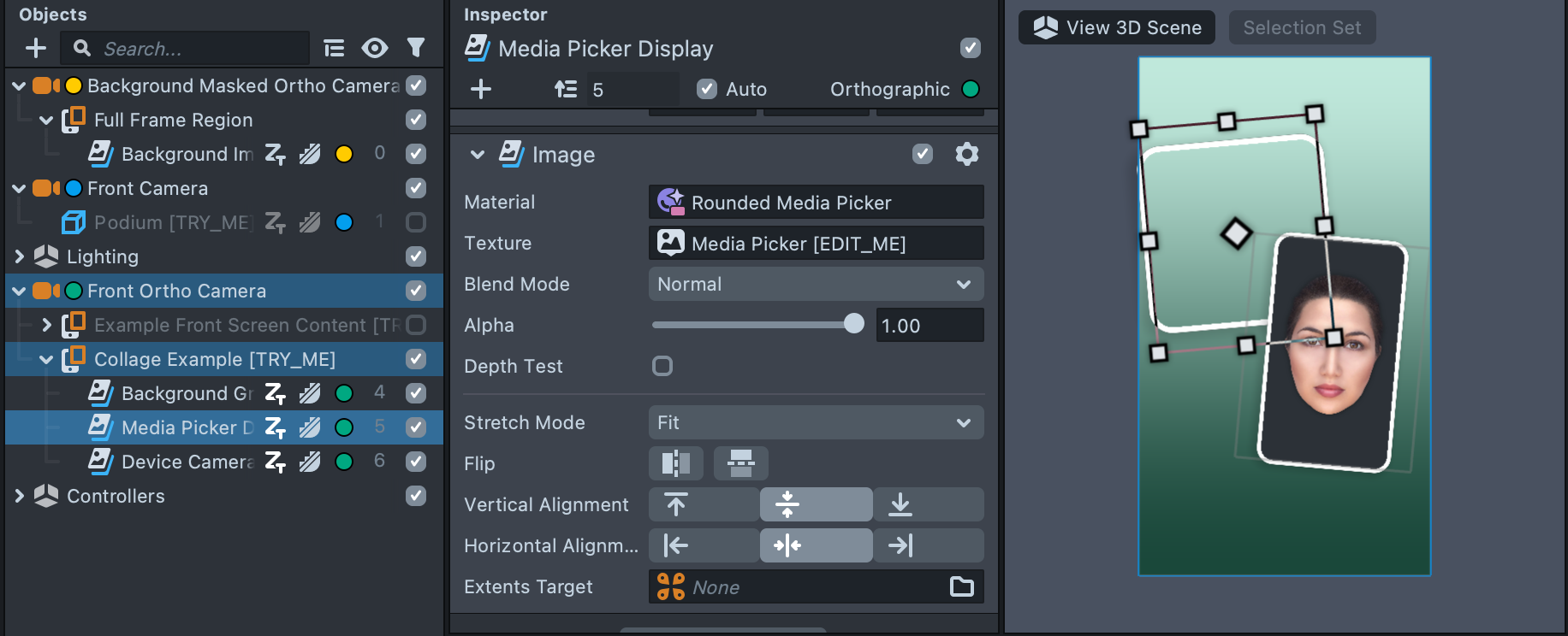
Using the Media as a Design Element
You can integrate the user’s media as an element in your Lens design. Enable the Collage Example to see an example.
The Media Picker texture is displayed on an Image component. However, unlike in the Background Image example, the image is displayed on a portion of the screen with a material that gives it a rounded white border.
When you use this example, delete the Background Masked Ortho Camera and the Podium and Example Front Screen Content, since the collage does not use them.
Right-click the Rounded Media Picker material, choose Select, and in the Inspector panel, click Graph Editor, to open the material and see how the rounded border material works.
Controlling the Media Picker
The template includes several controllers to help the Lens user have the best experience. The following are key features of the Controllers.
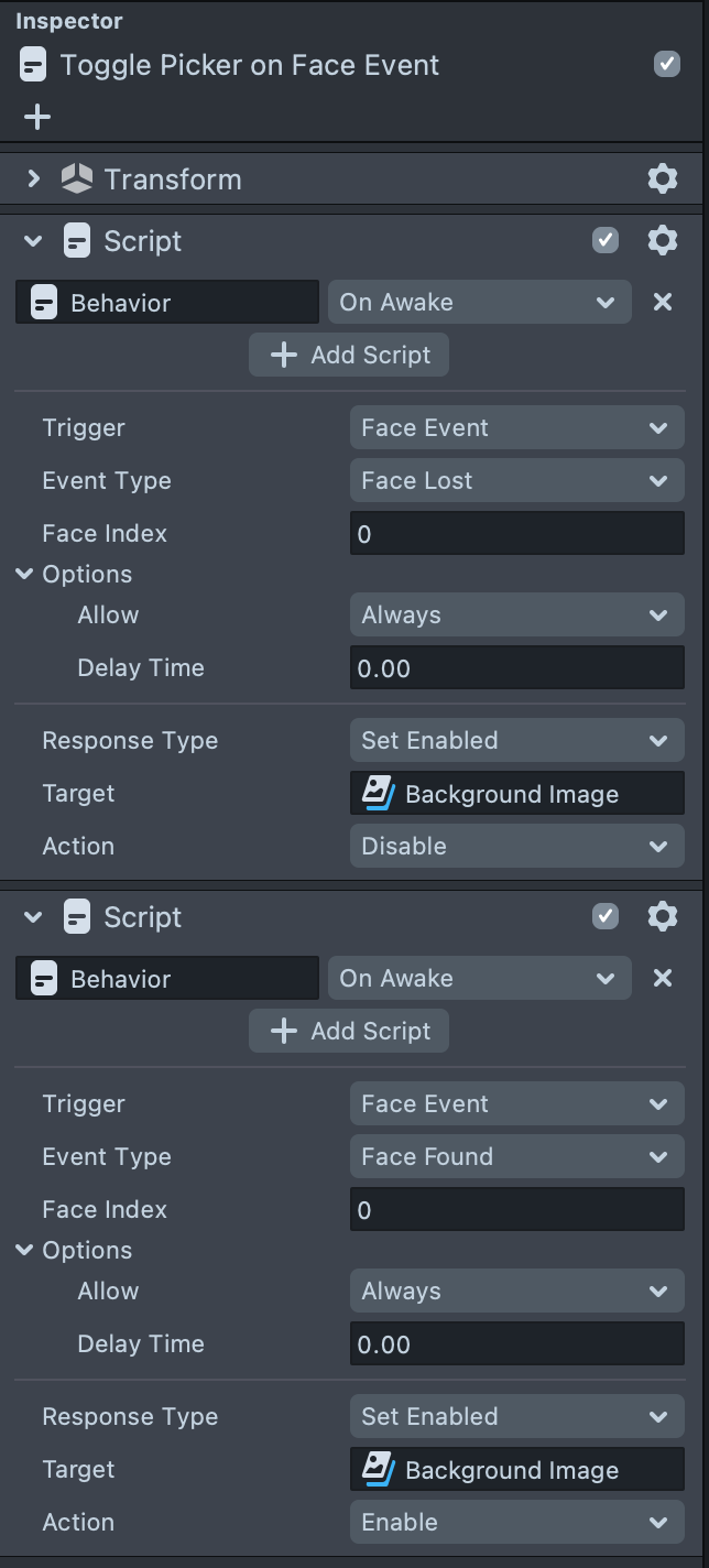
Displaying Media on Demand
On the Toggle Picker on Face Event object, two Behavior scripts control when the media is displayed. When the user’s face disappears from the camera, the application hides the media since the user’s camera is no longer in use. When the user activates the camera again, the media is displayed.
This behavior is controlling Background Image only, meaning that it is not used in the Collage example. As in the Collage Example, the camera feed is always shown next to the selected media.
Showing and Hiding the Media Picker
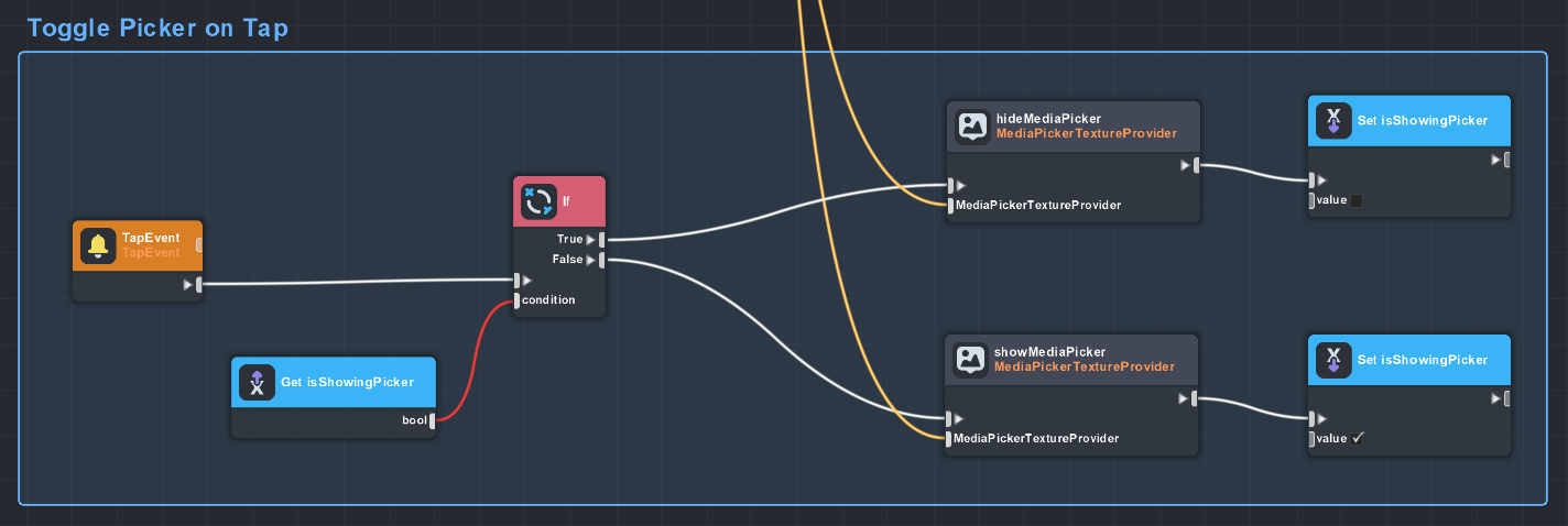
The Toggle Picker on Tap Script Graph allows the user to show and hide the media picker depending on their needs. Allowing the user to hide the media picker allows them to focus on framing their creation once their media is selected.
Right-click on a field and choose Select to find the asset in the Resources panel. Double-click to open the resource.
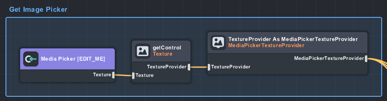
In the Get Image Picker section of the graph, we dragged the Media Picker texture from the Resources panel into the graph reference it. The control is configured to have access to its provider and communicate that it is a MediaPickerTextureProvider. This provider tells the Media Picker to show or hide the picker.
The MediaPickerTextureProvider flows into the Toggle Picker on Tapsection, where you call hide or show media pickers function.
Once you have decided to show or hide the picker, set the isShowingPicker variable to keep track of the MediaPicker’s status. This allows you to call the opposite function depending on whether you are showing the media picker.
Previewing Your Lens
You’re now ready to preview your Lens experience. To preview your Lens in Snapchat, follow the Pairing to Snapchat guide.
Related Guides
Please refer to the guides below for additional information: