Persistent Noteboard
To make it easier for you to mix-and-match our different examples, this template has been converted to an importable asset in the Asset Library with the name Input Modal for 5.0.
The Persistent Noteboard Template features a note-taking application that comprises two note-containers (i.e., boards) and an Input Modal for creating note entries.
This template is intended to demonstrate the use of:
- The Canvas component for World-space Screen Transform.
- Layout elements, which are a set of custom components for achieving auto-layout. There are container-types like Horizontal Layout and Vertical Layout, and basic types like Layout Element.
- The newly added to Asset Library 9 Slicing Material for stylized UI texture.
- The UI Button custom component as part of the UI Widgets custom component cohort.
Template Walkthrough
From a modular standpoint, the template is split into two parts: the boards and the Input Modal.
Boards
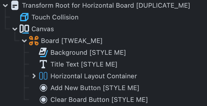
The board is where the notes live. It comprises three main parts:
- Add New Button
- Clear Board Button
- Container
Each board manages its own notes. The NoteBoard.js script is where the board’s main logic lives. You could style a board however you want, as long as you have all the necessary inputs of NoteBoard.js script set on the Transform Root Scene Object.
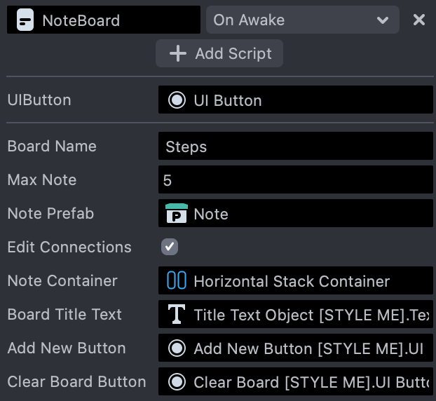
- Board Name: The board name is displayed on the board as a title.
- Max Entry: The maximum number of notes this board can hold. This variable is in place to make sure the notes do not grow out of the boundary of the board.
- Note Prefab: Notes are instantiated in runtime. The Note Prefab will be used to instantiate notes. The Note Prefab is required to have a NoteEntry.js script attached.
When Edit Connection is enabled, you can configure the following:
Note Container: A parent Scene Object for instantiated notes. In the template, every container Scene Object has a layout element (whether it is Horizontal Layout or Vertical Layout).
See more about the Flexbox custom components in the Flexbox Auto-layout Tools section.
NoteBoard.js offers some API methods for other scripts to easily interact with it. For more information, checkout the bottom of the NoteBoard.js script.
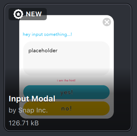
Input
The template makes use of the Asset Library's Input Modal standalone asset. The Input modal is used to gather input from the user when creating new or editing existing notes. For detailed instruction about this asset, go to Input Modal section.
The Input Modal is invoked either by a board's Add New Button or by an existing note. It demonstrates distinct behavior and styling when invoked differently.
- When invoked by an existing note, the
Deletebutton displays, allowing the note to be deleted. The caller note's content is also displayed in the input area, allowing the user to modify the content. When theConfirmbutton is pressed, the note's content will be replaced by whatever is still in the input field. - When an
Add NewButton invokes the input modal, theDeletebutton is hidden. When theConfirmbutton is tapped, a new note holding the contents of the input field is created.
Those project specific actions are implemented in InputModalController.js script.
Input Modal
Input Modal is a standalone item that enables a Lens to collect text input from the user with minimal configuration. The item is made up of various built-in UI elements, including UI Button custom component, Screen Image, Screen Text, and Interaction component.
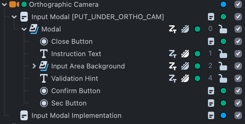
Installation
In the UI part of the Asset Library, you may locate Input Modal. A new Orthographic Camera Scene Object will be added to the Scene Hierarchy panel following installation. The Input Modal asset is positioned directly under the newly added Orthographic Camera.
Customization
InputModal.js is the script that enables Input Modal to function. To modify the asset for your own application, you should create a new script that references InputModal.js.
//@input Component.ScriptComponent modal;
It is advised to place all customisation code in the OnStartEvent to provide InputModal.js sufficient time to finish all initialization.
script.createEvent('OnStartEvent').bind(start);
function start() {
  //  the  rest  of  your  customization  code
}
Then you add callbacks to button tap events or modal show/hide events:
//confirm  button  callback
modal.onConfirmEvent.add(function (userInput) {
  //do  things  with  userInput
});
//supplementary  button  callback
modal.onSuppButtonPressEvent.add(function () {
  //invoke  when  the  supplementary  button  is  clicked
});
modal.onVisibilityChangeEvent.add(function (changedTo) {
  //invoke  when  modal  is  turned  on  or  off.
});
More often than not there will be a validation process applied to the text inputted by the user. Input Modal has a validation method built-in. The validation property is a function which takes a string as input, and returns an object that has two keys: valid and message. Their values are boolean and string, respectively. The validation function is executed when the Confirm button is tapped. When validation is passed (valid is true), the onConfirmEvent gets called. Otherwise the hintText will display the message returned by the validation function.
Here is an example:
//  set  up  the  validation  method.  validation  will  be  run  once  the  confirm  button  is  used
modal.validation = function (str) {
  if (validationFailed) {
    return {
      valid: false,
      message: 'explain  here  why  it  is  not  valid',
    };
  } else {
    return {
      valid: true,
      message: '',
    };
  }
};
You could also set the texts on every Text visible on the interface:
modal.hintText.set('hint  text');
modal.suppButtonText.set('cancel');
modal.confirmButtonText.set('confirm!');
modal.instructionText.set('instructions!');
modal.userInputText.set('this  is  the  placeholder  input  text...');
For the full API and example, take a look at the InputModal.js file.
New Material: 9 Slicing Material
9 Slicing Material designed to work with UI elements is available in the Asset Library. This newly added UI material is particularly useful if your UI texture has none-square borders such as rounded corners. The material preserves the shape of the frame but stretches the rest of the texture.
You can install the material from the Material section in the Asset Library.
A 9-slicing subgraph is also available in Material Editor to use in your custom materials
Auto-layout Tools: Layout Elements
To learn more about Custom Components, please visit the Custom Component Guide
Layout Elements
You can view the inheritance structure of all available layout elements in the image below
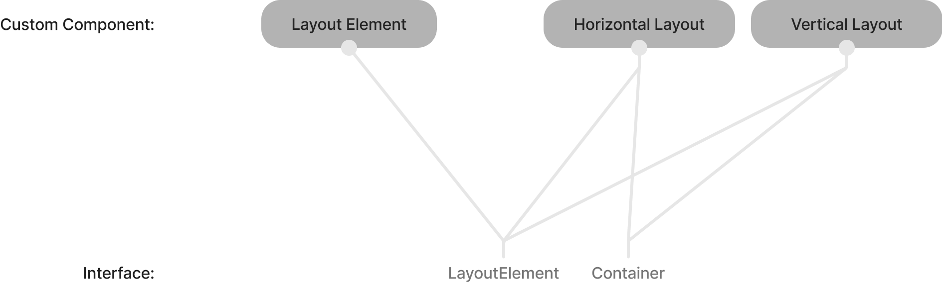
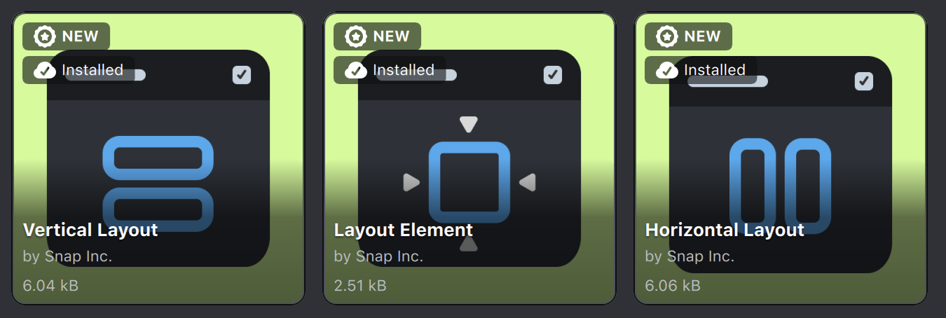
The Asset Library offers a collection of layout element Custom Components for accomplishing auto-layout as of Lens Studio 4.34. They consist of:
- Vertical Layout
- Horizontal Layout
- Layout Element
Both the Horizontal Layout and Vertical Layout Custom Components require the script module FlexboxModule as they are container-types. For your information, the FlexboxModule is modeled after the CSS Flexbox Layout Module. You can click on the following link to learn more about Flexbox.
Some properties are shared by all layout elements:
- Requested Size: The default size of this element.
- Margins: The spacing around this element.
- Minimum Size: When there isn’t enough space in the parent container, and if the Shrink Weight is not 0, the layout element will shrink to fit inside of the container. Minimum Size controls the minimum size this element can shrink into. For more about how the Shrink and Grow works, please see the Grow and Shrink section.
- Maximum Size: When there is an abundance of space in the container, and the Grow Weight of the element is not 0, the layout element will grow to fill the container. Maximum Size controls the maximum size this element can grow into. For more about how the Shrink and Grow works, please see the Grow and Shrink section.
- Grow Weight: Used by Maximum Size to determine how this element will grow.
- Shrink Weight: Used by Minimum Size to determine how this element will shrink.
Among all the properties on a layout element, Grow Weight and Shrink Weight are probably the less straightforward ones. To learn more, you can find the detailed instructions on Mozilla’s site for Grow Weight and Shrink Weight.
It is important to note that aside from the weights, all sizes, margins, and paddings on layout elements are specified in world units. In Lens Studio, world units are in centimeters. The final pixel size of elements are determined by both the value setting of the element and the properties of the camera that renders them.
You can find all available layout elements in the UI section in the Asset Library.
Layout Element
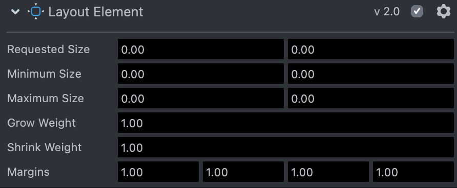
Layout Element is the basic layout element. It is the most simple way to allow a Screen Transform to be managed by a parenting container-type layout element like Horizontal Layout or Vertical Layout.
Right click on the mentioned custom components in the Asset Browser panel and select Unpack for Editing to check out their implementation.
Horizontal or Vertical Layout
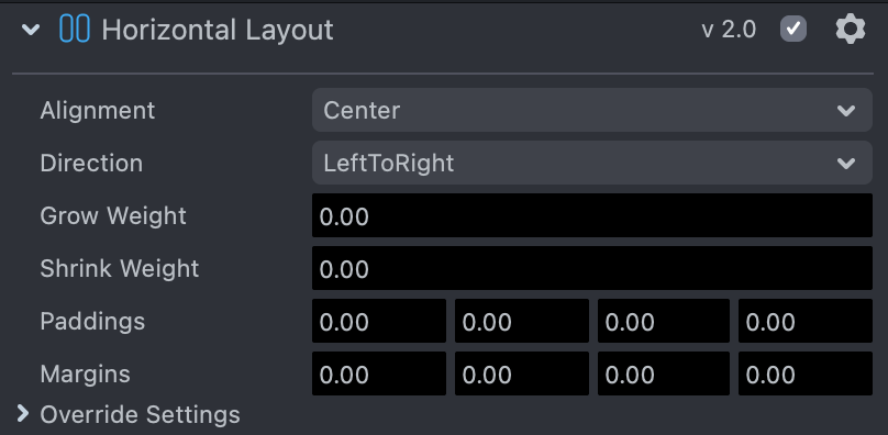
Horizontal Layout
Vertical Layout
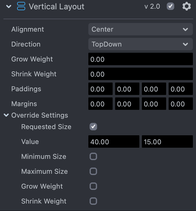
Horizontal/Vertical Layout is a container type element that arranges child layout elements horizontally or vertically according to specified settings. Each of them requires a Screen Transform Component.
- Alignment: Specifies the vertical or horizontal positioning of the children layout elements.
- Direction: Specifies the order of child layout elements.
- Paddings: Specifies a distance from the container screen rectangle.
- Override Settings: Allows overriding of individual settings of all children layout elements.