Rich Text
Rich text allows a singular Text or Text3D component to have multiple styles, including font, size, underline, and more.
To use rich text, you can enable Rich Text on a Text component.

Format
A markup system similar to HTML is used for rich text, using tags to determine the style of a piece of text. Tags are pieces of text enclosed within angle brackets.
This is <b>bold</b> text.

In this example, <b> is an opening tag and </b> is its corresponding closing tag.
The basic format rules are the following:
- All tags will be enclosed within angle brackets (ex.
<tag>) - Opening tags will be one of the following two formats:
<tag>or<tag=value> - Closing tags will be of the format
</tag> - Some standalone tags do not have closing tags (ex.
<br>) - Tags are case-insensitive and ignore whitespaces
If you have an opening tag without a corresponding closing tag, that opening tag applies until the end of the text.
This is <b>bold text and continues to be bold until the end.

Nesting and Entangling
To apply multiple styles onto a piece of text, you can nest tags.
This is <b><i>bold and italic</i></b> text.

If you nest multiple tags of the same type, the inner tag determines the actual style.
This is <color="red"><color="blue">blue</color></color> text.

Entangling tags means that tags can overlap—one tag can close before another one that was opened later, and both still apply independently to their respective ranges.
We have <b>bold text, <i>bold-italic text, </b>and italic text </i>.

Style Tags
<bold> and <italic>
The <bold> or <b> tag is used to apply bold styling to your text.
- Format:
<bold>Text</bold>or<b>Text</b>
The <italic> or <i> tag is used to apply italic styling to your text.
- Format:
<italic>Text</italic>or<i>Text</i>
This is regular text, <bold>this is bold text, <italic>this is bold-italic
text</bold>, and this is italic text.</italic>

<weight>
The <weight> tag is used to change the weight (thickness) of your text. You can assign any quoted integer from 100 to 1000.
- Format:
<weight="125">Text</weight> - The following weights have corresponding style names:
"100": Thin"200": ExtraLight"300": Light"400": Regular"500": Medium"600": SemiBold"700": Bold"800": ExtraBold"900": Heavy
This is regular text, <weight="200">this is extra light text, <weight="900">and
this is heavy text</weight></weight>.

<style>
The <style> tag is used to apply different styles to your text (ex. combinations of weight, italic, etc).
- Format:
<style="StyleName">Text</style> - For all types of font sources, the available style names are:
"Thin"and"Thin Italic""ExtraLight"and"ExtraLight Italic""Light"and"Light Italic""Regular"and"Regular Italic""Medium"and"Medium Italic""SemiBold"and"SemiBold Italic""Bold"and"Bold Italic""ExtraBold"and"ExtraBold Italic""Heavy"and"Heavy Italic"
- If your font source includes a variable font, you may also assign the name of a named instance or custom style (ex.
<style="NamedInstanceName">Text</style>or<style="CustomStyleName">Text</style>)
This is regular text, <style="ExtraLight Italic">this is extralight italic
text, <style="Heavy">and this is heavy text</style></style>.

Style Tags Nesting Rules
The actual style of text will be determined by its innermost tags, with weight and italic determined separately. The innermost bold, weight, or style tag will determine the weight, and the innermost italic or style tag will determine if it's italic or not.
<style="Light Italic">This is light italic, <bold>this is bold italic, <style="Heavy">this is heavy
(not italic), <italic>and this is heavy italic.</italic></style></bold></style>

Color Tags
Color and opacity tags are only supported for the 2D Text component.
<color>
The <color> tag is used to change text color. It takes the following types of values:
- Named colors
- Format:
<color="namedColor">Text</color> - The supported named colors are:
- Format:
| Name | RGB | Hex | Swatch |
|---|---|---|---|
| red | (255, 0, 0) | #FF0000 |  |
| blue | (0, 0, 255) | #0000FF |  |
| green | (0, 255, 0) | #00FF00 |  |
| white | (255, 255, 255) | #FFFFFF |  |
| yellow | (255, 255, 0) | #FFFF00 |  |
| black | (0, 0, 0) | #000000 |  |
| gray/grey | (128, 128, 128) | #808080 |  |
| orange | (255, 128, 0) | #FF8000 |  |
| purple | (128, 0, 128) | #800080 |  |
| pink | (255, 191, 204) | #FFBFCC |  |
| cyan | (0, 255, 255) | #00FFFF |  |
| magenta | (255, 0, 255) | #FF00FF |  |
| brown | (153, 77, 0) | #994D00 |  |
- Hex
- Format:
<color=#FFFFFF>Text</color>or<color=#FFFFFFFF>Text</color>for opacity as well
- Format:
- RGB or RGBA
- Format:
<color=rgb(r,g,b)>Text</color>or<color=rgb(r,g,b,a)>Text</color>or<color=rgba(r,g,b,a)>Text</color>, wherer,g,bare integers between 0 to 255, andais a float between 0.0 to 1.0
- Format:
- HSV
- Format:
<color=hsv(h,s,v)>Text</color>, wherehis an integer between 0 and 360, andsandvare integers between 0 and 100
- Format:
<color="purple">Purple, </color><color=#FF8C00>orange, </color><color=rgb(0,150,255)>sky blue,
</color><color=hsv(120,80,90)>green, </color><color=rgba(255,0,100,0.5)>and translucent pink.</color>

<opacity>
The <opacity> tag is used to change text opacity. It takes the following types of values:
- Float
- Format:
<opacity=a>Text</opacity>where a is a float between 0.0 and 1.0
- Format:
- Hex
- Format:
<opacity=#FF>Text</opacity>
- Format:
If you have both an <opacity> tag and a <color> tag that explicitly has an alpha value, the innermost tag will determine the opacity.
<opacity=0.5>This is 50% transparent, <color=rgba(255,0,0,1.0)>this is fully opaque red,
<opacity=0.2>and this is 20% transparent red.</opacity></color></opacity>

Opacity tags also apply to the outline and drop shadow of the Text component if enabled.
<opacity=1.0>F</opacity><opacity=0.9>a</opacity><opacity=0.8>d</opacity><opacity=0.7>i</opacity><opacity=0.6>n</opacity><opacity=0.5>g</opacity> <opacity=0.4>a</opacity><opacity=0.3>w</opacity><opacity=0.2>a</opacity><opacity=0.1>y</opacity><opacity=0.0></opacity>

Size Tag
<size>
The <size> tag is used to change text size. It takes in a float from 2.0 to 800.0.
- Format:
<size=size>Text</size>where size is a float from 2.0 to 800.0
This is default sized text, <size=200>this is huge text, </size><size=10.5>and this is tiny text.</size>

Font Family, Font Collection, and Font Tags
Font Family Asset
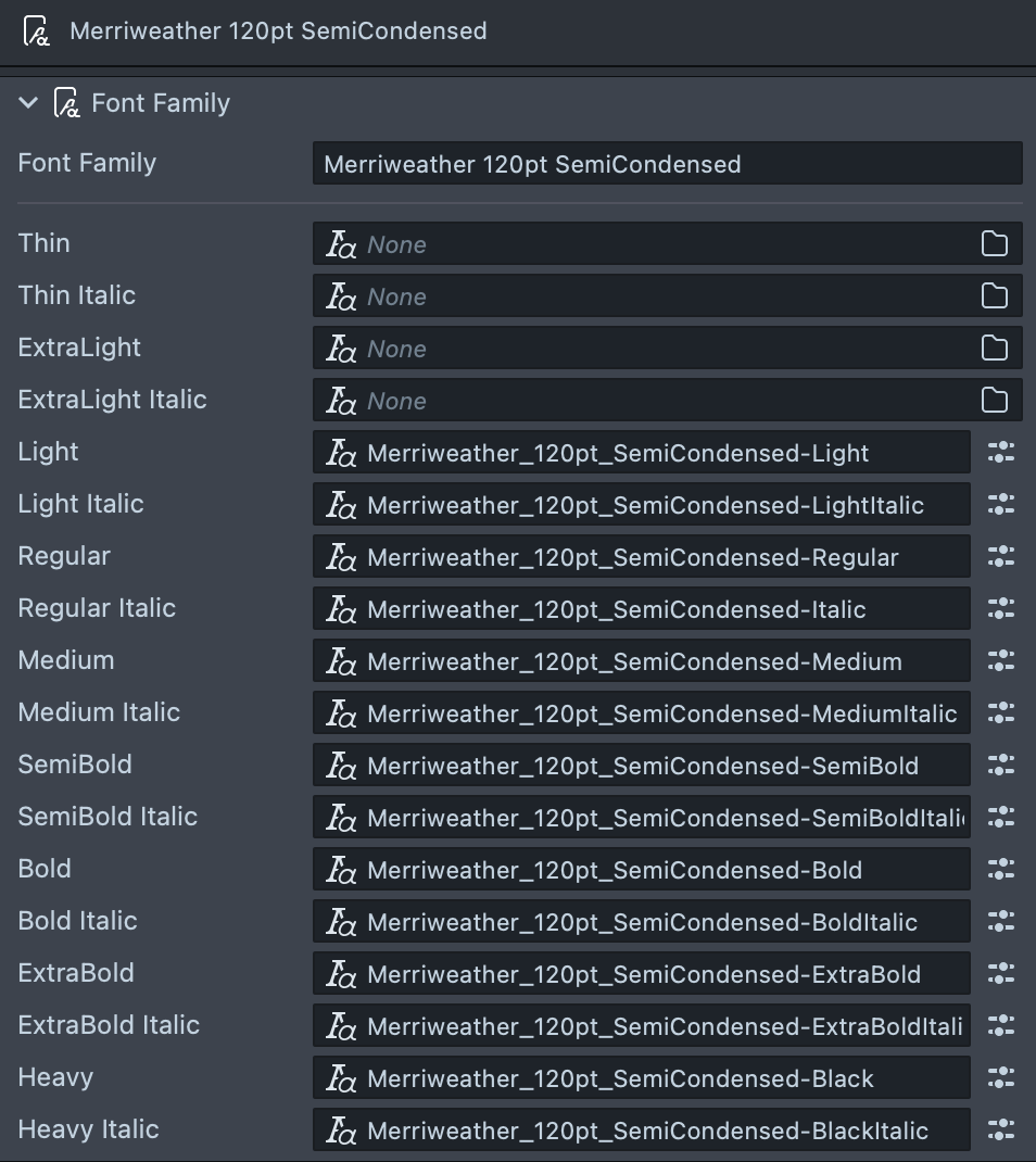
A Font Family asset is an asset used to group multiple Font assets into one font family. It supports a total of 18 different styles.
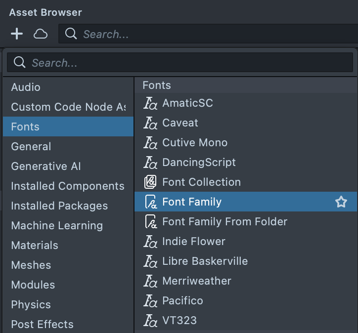
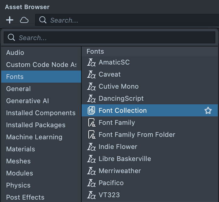
To create an empty Font Family asset, select + → Fonts → Font Family from the Asset Browser panel.
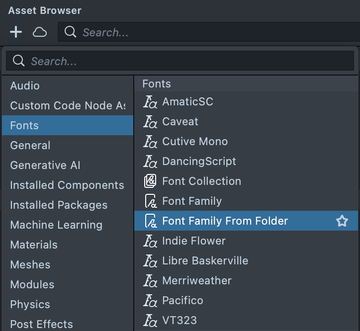
Selecting + → Fonts → Font Family From Folder will allow you to select a folder of fonts to import and attempt to create a Font Family asset with those fonts.
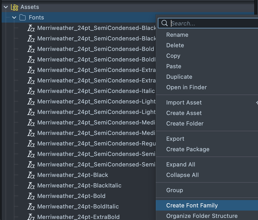
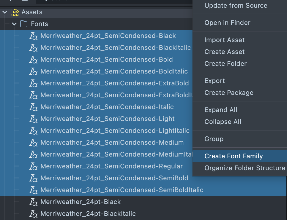
You can also create a Font Family asset from existing Font assets in your project. Right-click on a folder containing one or more Font assets, or select one or more Font assets directly, and select Create Font Family.
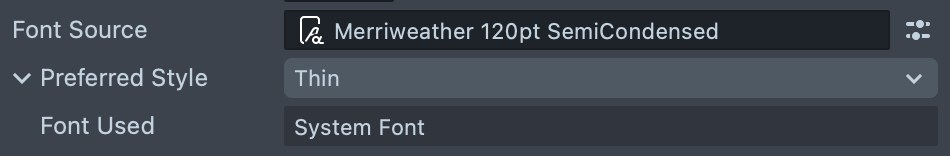
A Font Family asset can be assigned to the Font Source field of a Text component. By changing the Preferred Style, the corresponding Font asset in your Font Family asset will be used.
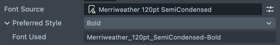
If you select a Preferred Style that has no corresponding entry in the Font Family asset, a system font will be used instead.
Font Collection Asset
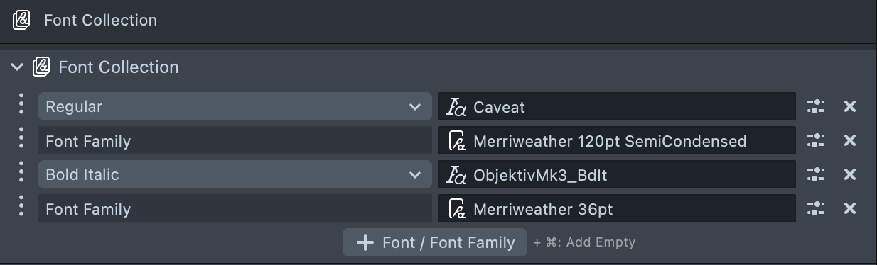
A Font Collection asset is an asset used to group multiple Font and/or Font Family assets together.
To create an empty Font Collection asset, select + → Fonts → Font Collection from the Asset Browser panel.
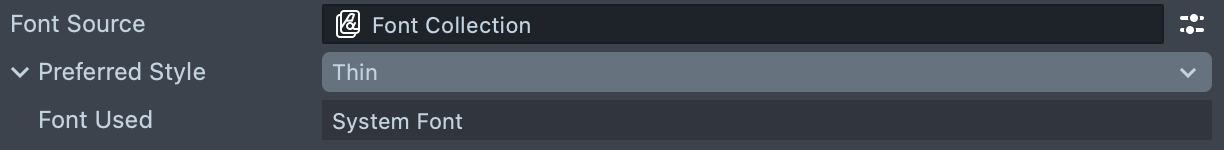
A Font Collection asset can be assigned to the Font Source field of a Text component. By changing the Preferred Style, the first matching Font asset in your Font Collection—including those within Font Family assets—will be used.
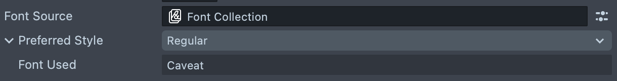
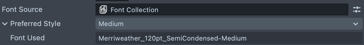
If you select a Preferred Style that has no corresponding entry in the Font Collection asset, a system font will be used instead.
<font> and <family>
The <font> tag is used to change the font that the text uses by specifying a Font asset name.
- Format:
<font="fontAssetName">Text</font> - This must match the name of your Font asset (case and whitespace-insensitive) (for example, "Arial-Regular").
The <family> tag is used to change the font family that the text uses.
- Format:
<family="fontFamily">Text</family> "fontFamily"will be the same as what you put in theFont Familyfield in a Font Family Asset. The specific font that is used will be based on whatever style is currently set, via inspector or<italic>,<bold>,<weight>and/or<style>tags.
For these fonts to actually be available to your Text component, you must assign a Font, FontFamily, or FontCollection asset to the Font Source field of your component containing the font or font family specified in your tag.
You can explicitly use system fonts by using <font="System"> or <family="System">.
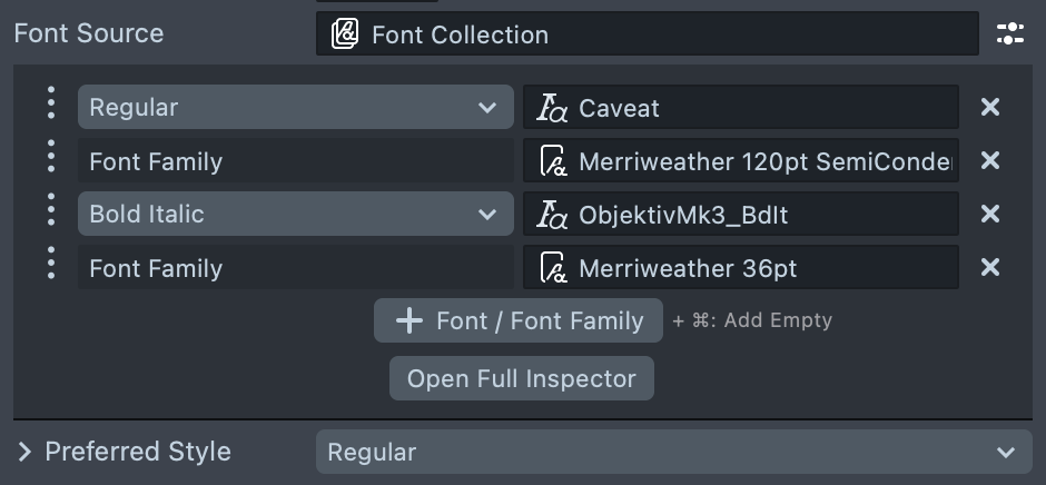
This uses the first font with style Regular, <font="ObjektivMk3_BdIt">this uses the Font asset named
ObjektivMk3_BdIt</font>, <family="Merriweather 120pt SemiCondensed"><b>this uses the bold style from Merriweather 120pt
SemiCondensed font family</b>, <style="Light Italic">and this uses the light italic style from Merriweather
120pt SemiCondensed font family.</style></family>

Note that the Font Used field does not reflect any rich text tags. It will only show the font that would be used from purely inspector settings.

Decoration Segment Tags
<underline> and <strikethrough>
The <underline> or <u> tag is used to apply a horizontal line under your text.
- Format:
<underline>Text</underline>or<u>Text</u>
The <strikethrough> or <s> tag is used to apply a horizontal line through the middle of your text.
- Format:
<strikethrough>Text</strikethrough>or<s>Text</s>
This is regular text, <u>this is underlined text, <s>this is underlined and
strikethrough text</u>, and this is strikethrough text.</s>

Miscellaneous Tags
<lt> and <gt>
The <lt> tag is used to display the literal less-than (<) in rich text content.
- Format:
<lt>
The <gt> tag is used to display the literal greater-than (>) characters in rich text content.
- Format:
<gt>
In order to display the literal "<lt>" and "<gt>" characters in your Text
component, you should use the <lt>lt<gt> and <lt>gt<gt> tags.

<br>
The <br> tag is used to add a line break to your text.
- Format:
<br>
This is the first line, <br>this is the second line, <br><br>and this is the fourth line.