Confirmation Slider
This is a specialized slider for high intent interactions. Are you confirming a payment, a message send or a settings change? Do you want to confirm the user is sure they want to take that action? This slider is for you.
Component Breakdown
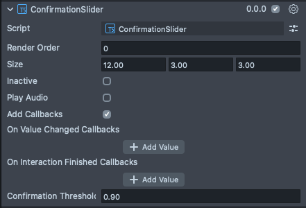
Render Order | Sets the renderOrder for the visuals of the element. |
Size | Sets the size of the element. X is width, Y is height and Z is the depth of the underlying collider. |
Inactive | Makes the element impossible to interact with. Think "grayed out". |
Play Audio | Turns on the built-in audio cues for the element. |
Add Callbacks | Adds the editor hooks for the event callbacks to the element. |
On Value Changed Callbacks | A callback for when the element's value changes. |
On Interaction Finished Callbacks | A callback for when the element interaction and changes are all finished. |
Code Example
- TypeScript
- JavaScript
import { ConfirmationSlider } from 'SpectaclesUIKit.lspkg/Scripts/Components/Slider/ConfirmationSlider';

/**
 * Example script for the ConfirmationSlider component.
 * It creates a confirmation slider and prints a message when it is confirmed.
 */

@component
export class ExampleConfirmationSliderScript extends BaseScriptComponent {
  onAwake() {
    const slider = this.sceneObject.createComponent(
      ConfirmationSlider.getTypeName()
    );
    slider.size = new vec3(20, 4, 1);
    slider.initialize();
    slider.onConfirmation.add(() => {
      print(`Confirmation slider confirmed`);
    });
  }
}
// Import required modules
const ConfirmationSlider =
  require('SpectaclesUIKit.lspkg/Scripts/Components/Slider/ConfirmationSlider').ConfirmationSlider;

/**
 * Example script for the ConfirmationSlider component.
 * It creates a confirmation slider and prints a message when it is confirmed.
 */

function onAwake() {
  const slider = script.sceneObject.createComponent(
    ConfirmationSlider.getTypeName()
  );
  slider.size = new vec3(20, 4, 1);
  slider.initialize();
  slider.onConfirmation.add(() => {
    print(`Confirmation slider confirmed`);
  });
}

// Start the script
onAwake();
Was this page helpful?