TextInputField
A component for creating text input fields. It automatically calls the keyboard of the selected type, updates the displayed text, and manages text rendering for you.
Component Breakdown
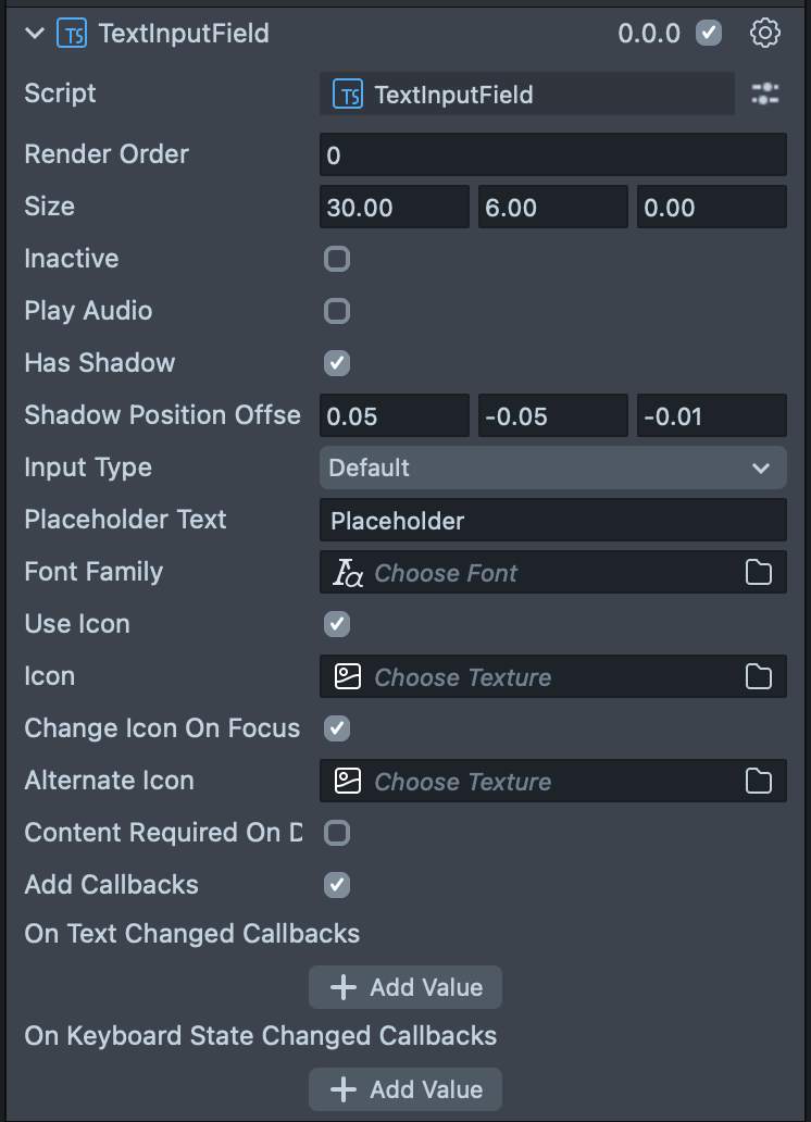
Render Order | Sets the renderOrder of the visual components of the element. |
Size | Sets the size of the element. X is width, Y is height and Z is the depth of the underlying collider. |
Inactive | Makes the element impossible to interact with. Think "grayed out". |
Play Audio | Turns on the built-in audio cues for the element. |
Has Shadow | Turns on the built in shadow for this element. |
Shadow Position Offset | (shows if Has Shadow is checked) The offset position for the shadow. |
Input Type | Sets the type of text that can be input into this field. The options are: Default, Numeric, Password, and Pin. |
Placeholder Text | Adds placeholder text which is displayed when the the TextInputField is empty. |
Font Family | Sets a font asset. |
Use Icon | Turn on an icon to display on the left side of the TextInputField. |
Icon | (only visible when Use Icon is selected) Sets the texture for the icon on the left. |
Change Icon On Focus | (only visible when Use Icon is selected) Turns on a behavior that swaps the icon when the TextInputField is selected. |
Alternate Icon | (only visible when Change Icon on Focus is selected) Sets the texture for the icon during focus. |
Content Required On Deactivate | Turns on a behavior which throws a warning if you try to leave this TextInputField empty. |
Add Callbacks | Adds the editor hooks for the event callbacks to the element. |
On Text Changed Callbacks | A callback for when text changes in the TextInputField. |
On Keyboard State Changed Callbacks | A callback from when the keyboard opens or closes. |
Code Example
- TypeScript
- JavaScript
import { TextInputField } from 'SpectaclesUIKit.lspkg/Scripts/Components/TextInputField/TextInputField';

/**
 * Example script for the TextInputField component.
 * It creates a text input field and sets its placeholder text and input type.
 */

@component
export class ExampleTextInputFieldScript extends BaseScriptComponent {
  onAwake() {
    const textInputField = this.sceneObject.createComponent(
      TextInputField.getTypeName()
    );
    textInputField.placeholderText = 'Enter your name';
    textInputField.inputType = 'default';
    textInputField.size = new vec3(15, 3, 1);
  }
}
// Import required modules
const TextInputField =
  require('SpectaclesUIKit.lspkg/Scripts/Components/TextInputField/TextInputField').TextInputField;

/**
 * Example script for the TextInputField component.
 * It creates a text input field and sets its placeholder text and input type.
 */

function onAwake() {
  const textInputField = script.sceneObject.createComponent(
    TextInputField.getTypeName()
  );
  textInputField.placeholderText = 'Enter your name';
  textInputField.inputType = 'default';
  textInputField.size = new vec3(15, 3, 1);
}

// Start the script
onAwake();
Was this page helpful?