Slider
This is a slider component that allows users to select a value within a specified range with a dragging interaction.The slider includes a draggable knob and emits events when the value changes or interaction finishes. The value is normalized from 0 and 1. The knob's position is updated based on the current value. And, The component supports animations for knob position updates.
Component Breakdown
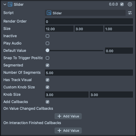
Render Order | Sets the renderOrder for the visuals of the element. |
Size | Sets the size of the element. X is width, Y is height and Z is the depth of the underlying collider. |
Inactive | Makes the element impossible to interact with. Think "grayed out". |
Play Audio | Turns on the built-in audio cues for the element. |
Default Value | The starting value, between 0 and 1, for the knob of the slider and values of the slider. |
Snap To Trigger Position | Enables a jump to trigger position behavior on the track. So, if the knob is at 0 and you pinch around halfway on the track, the knob will move there automatically, no need to drag. |
Segmented | This checkmark enables a segmented (or digital) behavior for the slider. So instead of smoothly dragging, it will subdivide the slider into stops. |
Number of Segments | Sets the number of segments from start to finish inclusive. So if you set this to 3, the three segments will be 0, .5, and 1. |
Has Track Visual | Turns on the default track visual for this element. |
Custom Knob Size | Turns on controls for the knob size. |
Knob Size | (shows if Custom Knob Size is checked) Set the size of the knob inside of the element. |
Add Callbacks | Adds the editor hooks for the event callbacks to the element. |
On Value Changed Callbacks | A callback for when the element's value changes. |
On Interaction Finished Callbacks | A callback for when the element interaction and changes are all finished. |
Code Example
- TypeScript
- JavaScript
import { DegToRad } from 'SpectaclesInteractionKit.lspkg/Utils/mathUtils';
import { Slider } from 'SpectaclesUIKit.lspkg/Scripts/Components/Slider/Slider';

/**
 * A simple programmatic slider example
 */

@component
export class ExampleSliderScript extends BaseScriptComponent {
  onAwake() {
    const slider = this.sceneObject.createComponent(Slider.getTypeName());
    slider.size = new vec3(20, 4, 1);
    slider.transform.setLocalRotation(
      quat.fromEulerVec(new vec3(0, 0, DegToRad * -90))
    );
    slider.initialize();
    slider.onValueChange.add((value) => {
      print(`Switch value changed to ${value}`);
    });
  }
}
// Import required modules
const DegToRad =
  require('SpectaclesInteractionKit.lspkg/Utils/mathUtils').DegToRad;
const Slider =
  require('SpectaclesUIKit.lspkg/Scripts/Components/Slider/Slider').Slider;

/**
 * A simple programmatic slider example
 */

function onAwake() {
  const slider = script.sceneObject.createComponent(Slider.getTypeName());
  slider.size = new vec3(20, 4, 1);
  slider.transform.setLocalRotation(
    quat.fromEulerVec(new vec3(0, 0, DegToRad * -90))
  );
  slider.initialize();
  slider.onValueChange.add((value) => {
    print(`Switch value changed to ${value}`);
  });
}

// Start the script
onAwake();
Was this page helpful?