Tooltip
This component creates a pop-up tooltip when hovering over its parent. Create a child object, create this Tooltip component, and use its transform to position it.
Component Breakdown
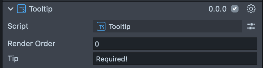
Render Order | Sets the renderOrder for the visuals of the element. |
Tip | Sets the text of the Tooltip. |
Code Example
- TypeScript
- JavaScript
import { TextInputField } from 'SpectaclesUIKit.lspkg/Scripts/Components/TextInputField/TextInputField';
import { Tooltip } from 'SpectaclesUIKit.lspkg/Scripts/Tooltip';

/**
 * Example script for the Tooltip component.
 * It creates a text input field and a tooltip and sets the tooltip's text and position.
 */

@component
export class ExampleTooltipScript extends BaseScriptComponent {
  onAwake() {
    const textInputField = this.sceneObject.createComponent(
      TextInputField.getTypeName()
    );
    textInputField.placeholderText = 'Enter your name';
    textInputField.inputType = 'default';
    textInputField.size = new vec3(15, 3, 1);

    const tooltipObject = global.scene.createSceneObject('Tooltip');
    tooltipObject.setParent(this.sceneObject);
    const tooltip = tooltipObject.createComponent(Tooltip.getTypeName());
    tooltip.tip = 'This is a tooltip';
    tooltipObject.getTransform().setLocalPosition(new vec3(0, 4, 0));
  }
}
// Import required modules
const TextInputField =
  require('SpectaclesUIKit.lspkg/Scripts/Components/TextInputField/TextInputField').TextInputField;
const Tooltip = require('SpectaclesUIKit.lspkg/Scripts/Tooltip').Tooltip;

/**
 * Example script for the Tooltip component.
 * It creates a text input field and a tooltip and sets the tooltip's text and position.
 */

function onAwake() {
  const textInputField = script.sceneObject.createComponent(
    TextInputField.getTypeName()
  );
  textInputField.placeholderText = 'Enter your name';
  textInputField.inputType = 'default';
  textInputField.size = new vec3(15, 3, 1);

  const tooltipObject = global.scene.createSceneObject('Tooltip');
  tooltipObject.setParent(script.sceneObject);
  const tooltip = tooltipObject.createComponent(Tooltip.getTypeName());
  tooltip.tip = 'This is a tooltip';
  tooltipObject.getTransform().setLocalPosition(new vec3(0, 4, 0));
}

// Start the script
onAwake();
Was this page helpful?