Switch
This component is a special kind of toggle element. It has a "switch" style visual and interaction. It can be set to on or off and it has it's own specific toggle group called SwitchToggleGroup.
Each switch has two distinct pieces: the knob (or the thumb), and the track.
Component Breakdown
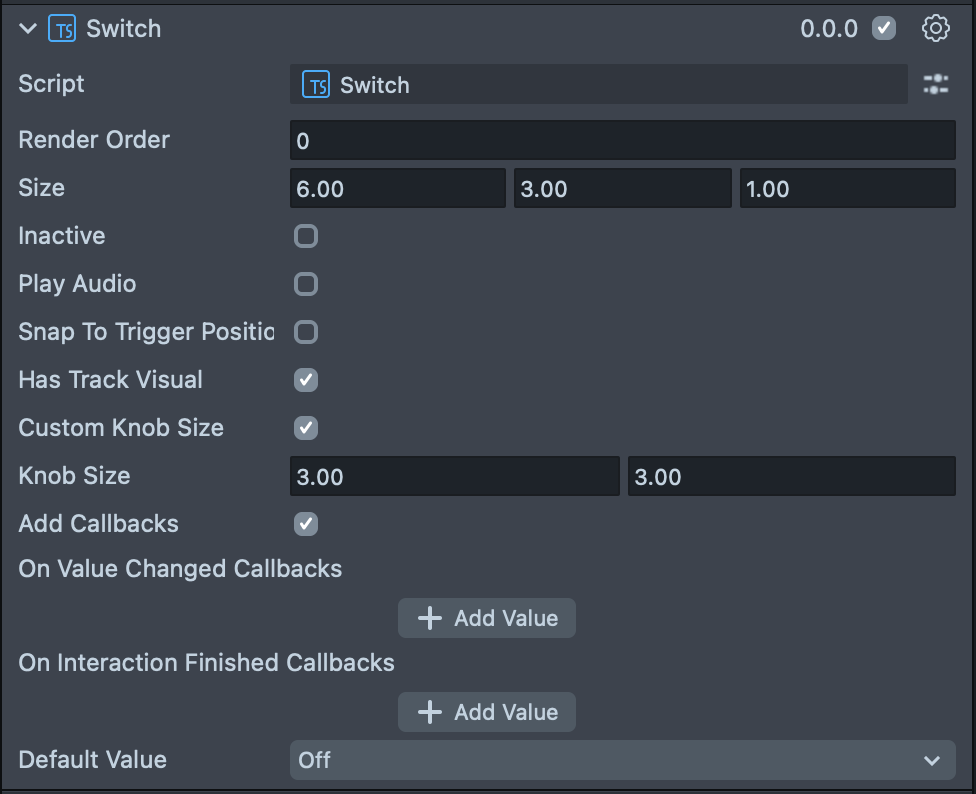
Render Order | Sets the renderOrder for the visuals of the element. |
Size | Sets the size of the element. X is width, Y is height and Z is the depth of the underlying collider. |
Inactive | Makes the element impossible to interact with. Think "grayed out". |
Play Audio | Turns on the built-in audio cues for the element. |
Has Track Visual | Turns on the default track visual for this element. |
Custom Knob Size | Turns on controls for the knob size. |
Knob Size | (shows if Custom Knob Size is checked) Set the size of the knob inside of the element. |
Add Callbacks | Adds the editor hooks for the event callbacks to the element. |
On Value Changed Callbacks | A callback for when the element's value changes. |
On Finished Callbacks | A callback for when the element interaction and changes are all finished. |
Default Value | (shows if Toggleable is checked) Sets the default state of the toggleable button to "on". |
Code Example
- TypeScript
- JavaScript
import { Switch } from 'SpectaclesUIKit.lspkg/Scripts/Components/Switch/Switch';

/**
 * A simple programmatic switch example
 */

@component
export class ExampleSwitchScript extends BaseScriptComponent {
  onAwake() {
    const demoSwitch = this.sceneObject.createComponent(Switch.getTypeName());
    demoSwitch.size = new vec3(10, 4, 1);
    demoSwitch.initialize();

    demoSwitch.onValueChange.add((value) => {
      print(`Switch value changed to ${value}`);
    });
  }
}
// Import required modules
const Switch =
  require('SpectaclesUIKit.lspkg/Scripts/Components/Switch/Switch').Switch;

/**
 * A simple programmatic switch example
 */

function onAwake() {
  const demoSwitch = script.sceneObject.createComponent(Switch.getTypeName());
  demoSwitch.size = new vec3(10, 4, 1);
  demoSwitch.initialize();

  demoSwitch.onValueChange.add((value) => {
    print(`Switch value changed to ${value}`);
  });
}

// Start the script
onAwake();
Was this page helpful?